

The interior design series here showcases my new passion in the arts. As most of you know, I am no stranger to maximalism and decoration…I just can’t help myself. Sure if a client wants a minimalistic style then I will provide that. There is beauty in art in all styles! Personally I adore the 19th Century interior and wanted to explore and widen my scope. This project has given me an opportunity to learn new skills, experiment with composition and apply my art to the interior. Enjoy and explore! If you need help with a room and are stuck? Reach out to me!: Contact

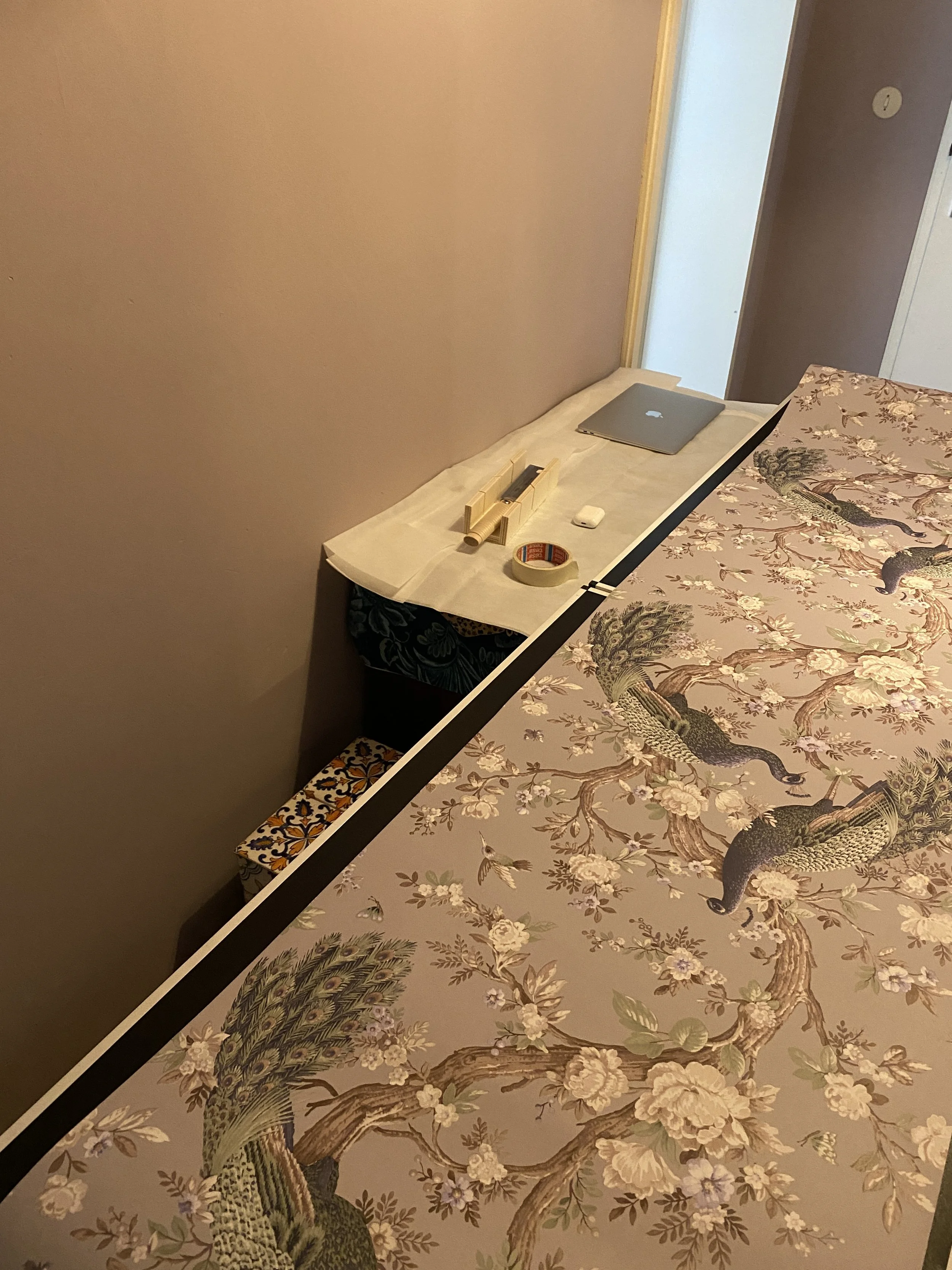
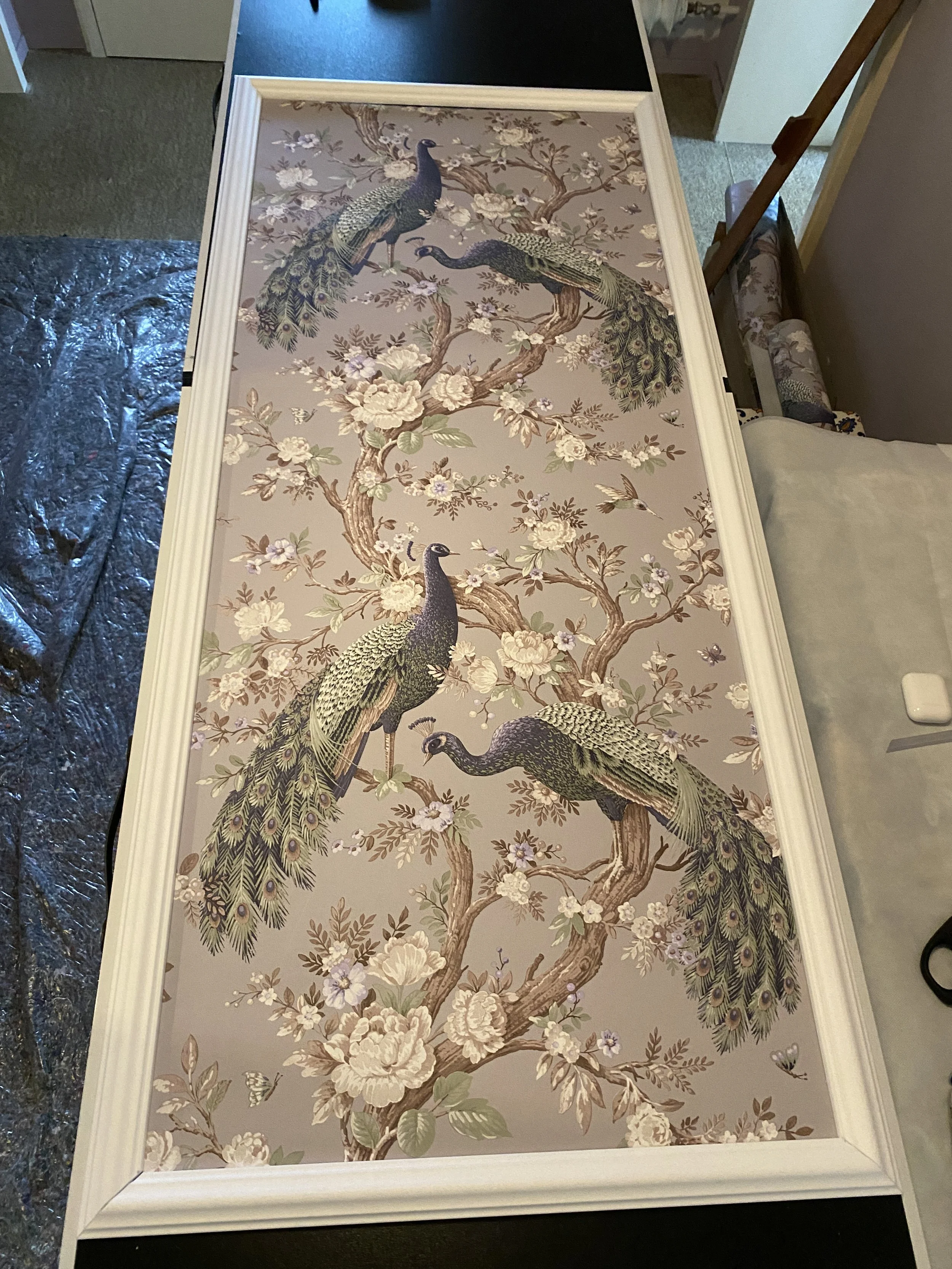
It’s always fun to experiment with different fabric
Bedroom renovation project
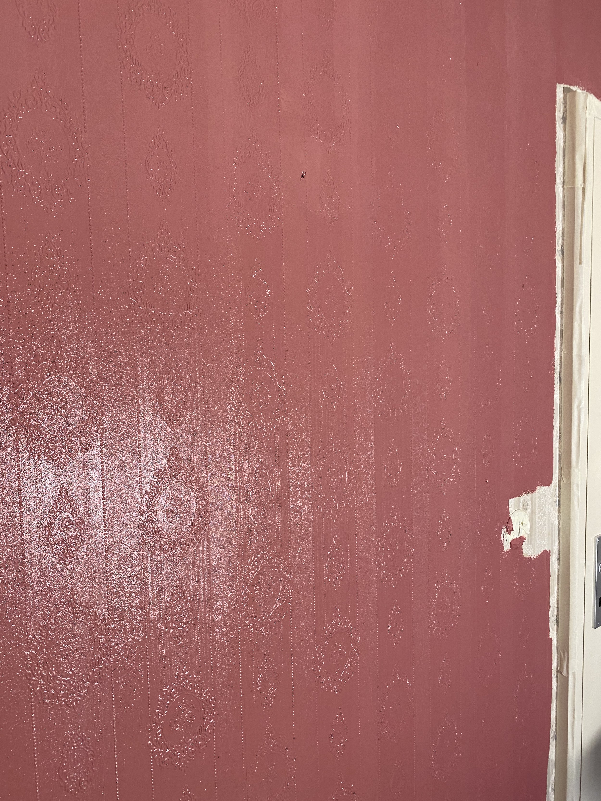
The bedroom before had a vintage wallpaper from the early 60s with a traditional flower rough printed pattern. Instead of tearing down the wallpaper which would have caused great damage to the integrity of the wall, it was decided to best leave the wallpaper and paint over it with a lighter colour. A lighter colour was chosen in order to let the rough pattern shine through, creating a vintage old english style feeling.
Below you can see the process of cleaning the old wall, taping all door frames and window stills in order to ensure a clean paint job. In the end, an old english red/rosé was chosen to ensure that during daylight the room is light and during the evening, a warm rich colour fills the room. At first a darker traditional red was considered but, one always has to consider how dark the room will be without daylight!


End results
After finishing the walls the next step begins: putting the pieces together! The old wooden cupboard was kept and given a new paint to freshen up the room even further. A pastel green/grey colour was chosen for the cupboard since it matched the metal bed. Next, existing paintings were chosen and arranged on the wall. To keep the old 19th Century english style, still life paintings in gold frames were chosen. To add a modern touch, contemporary art with no frames were added. The result?: A traditional yet fresh room that allows for variation!


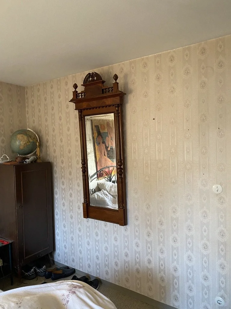
Before…
This is in fact a beautiful vintage wallpaper from the 70s. the flower motif with structured wallpaper was very popular and I didn’t want to take it down since that would have been a waste. Such well put wallpaper can easily be painted over and integrated into your new stylish room.
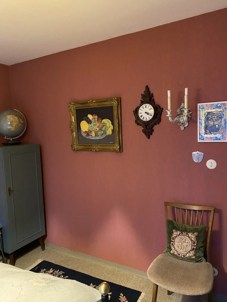
After…
This warm color could perfectly be combined with the already existing decor elements. The old wooden cabinet was also given a fresh color - forest dusty green to add a small modern twist.
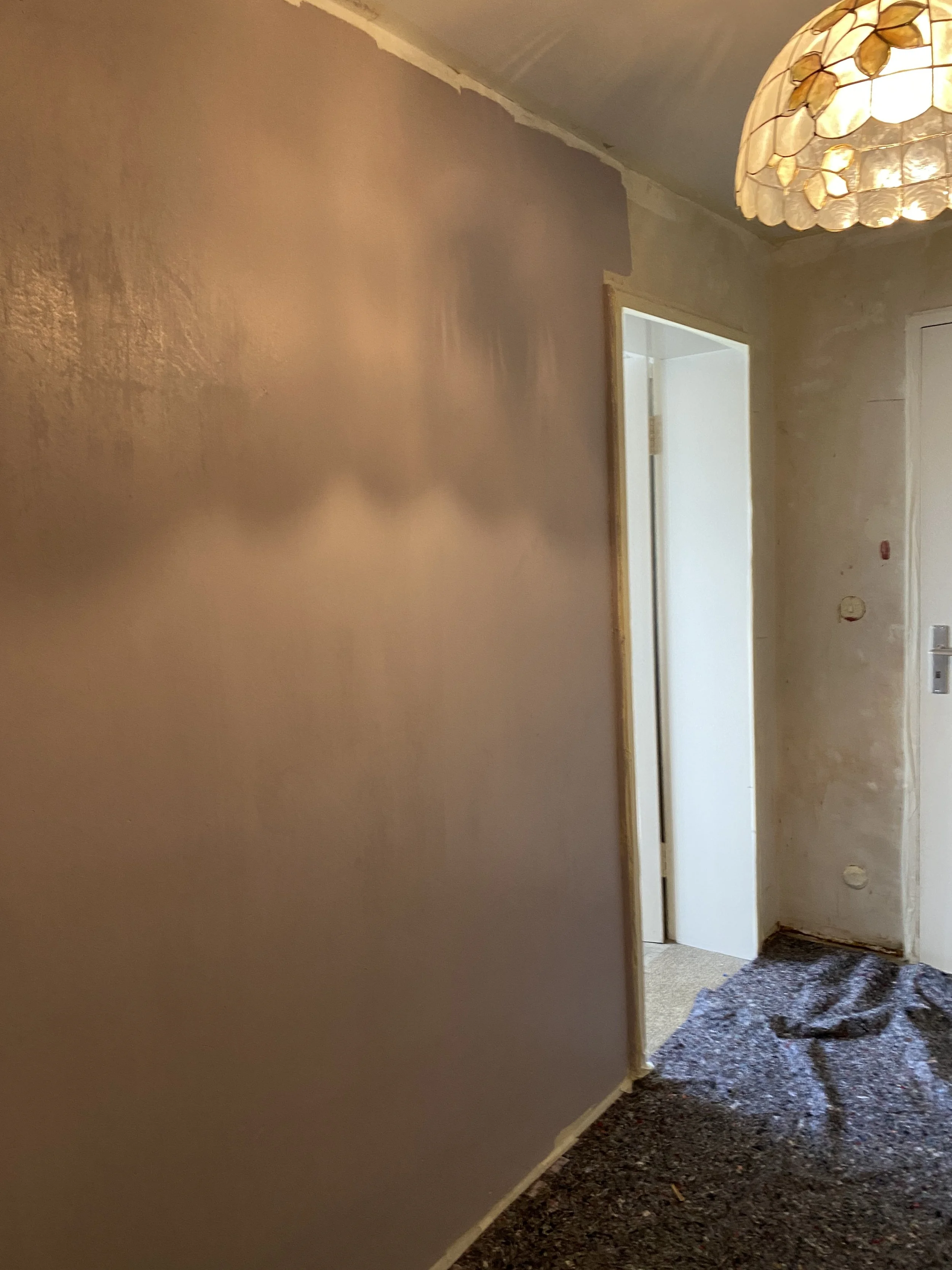
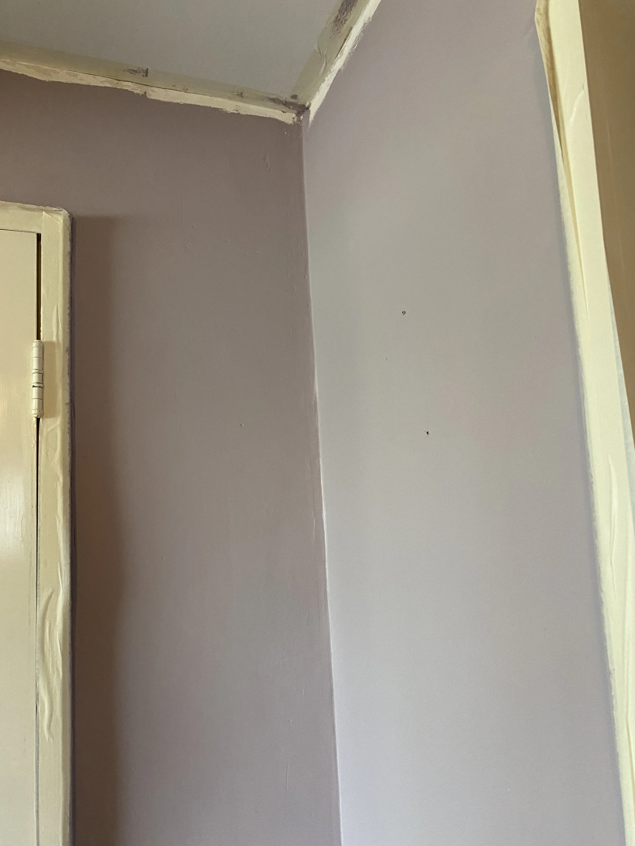
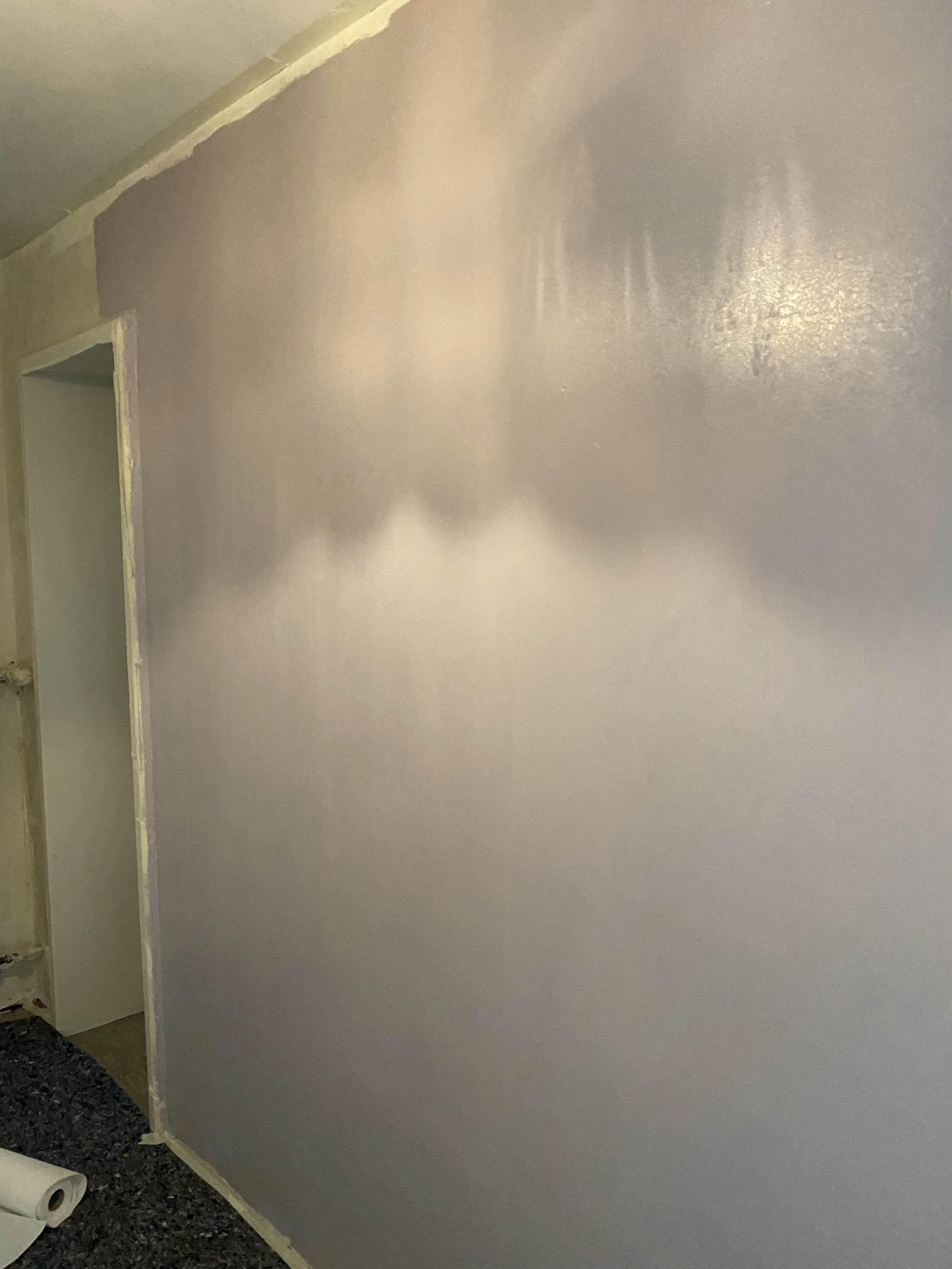
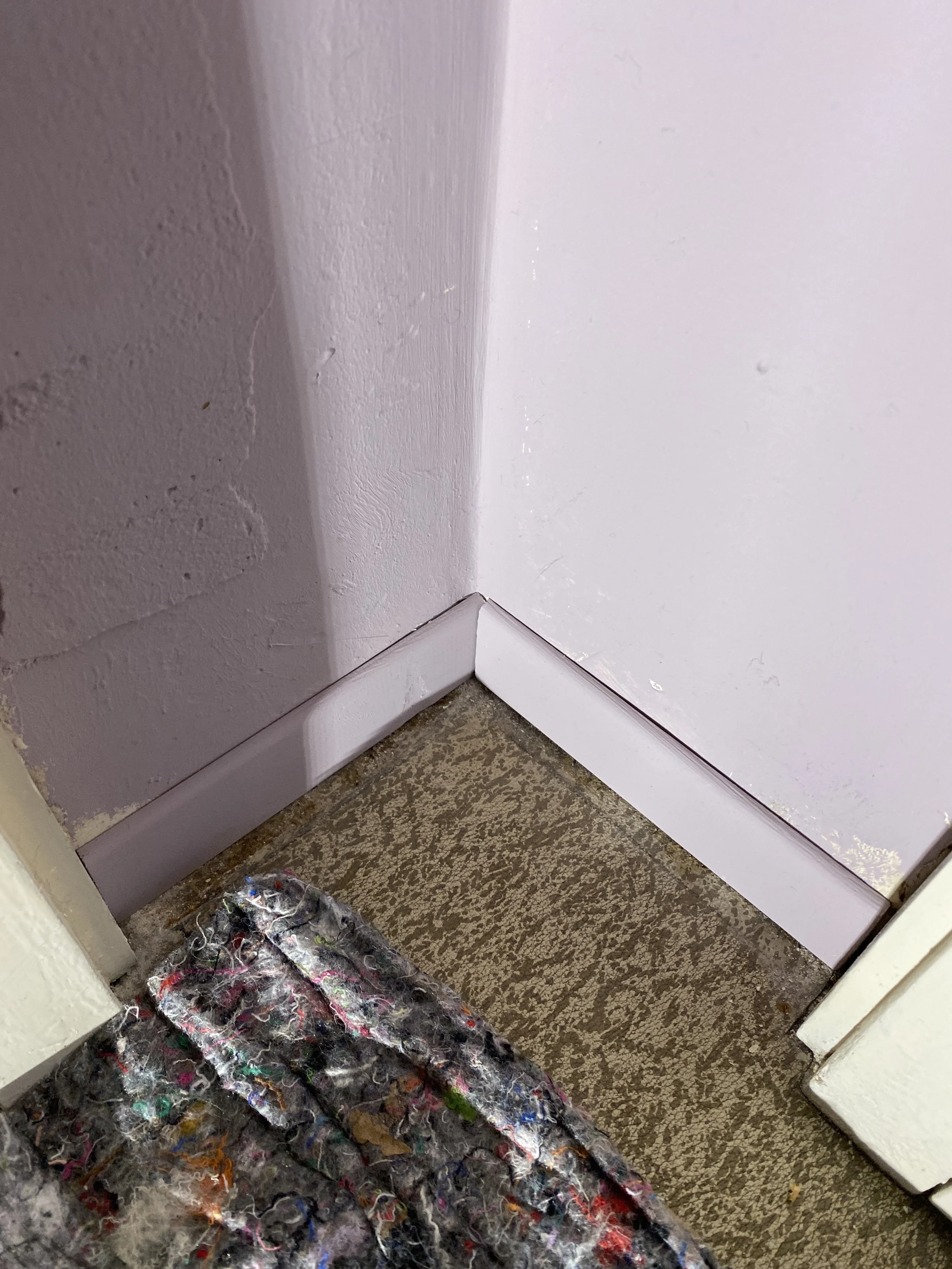
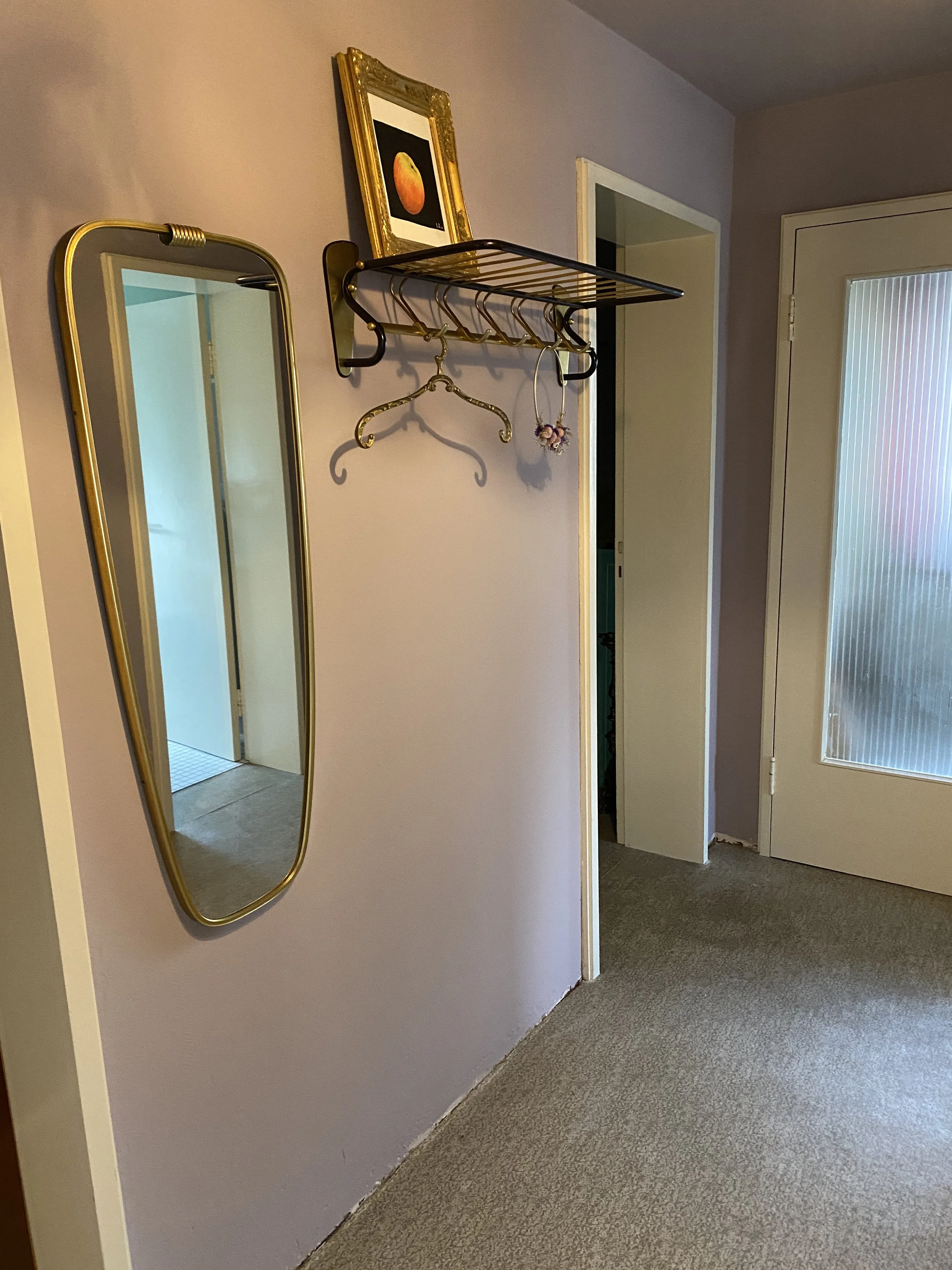
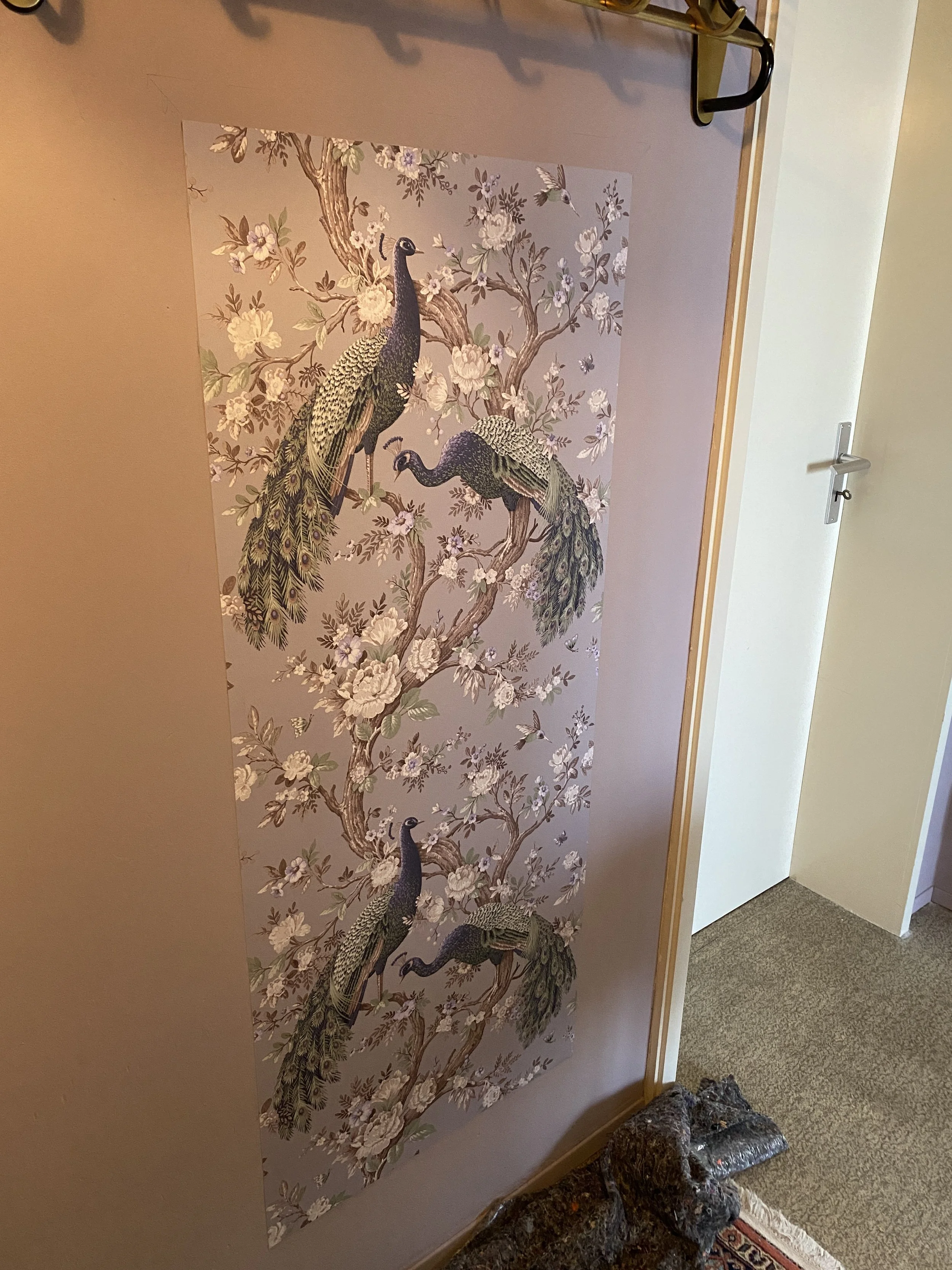
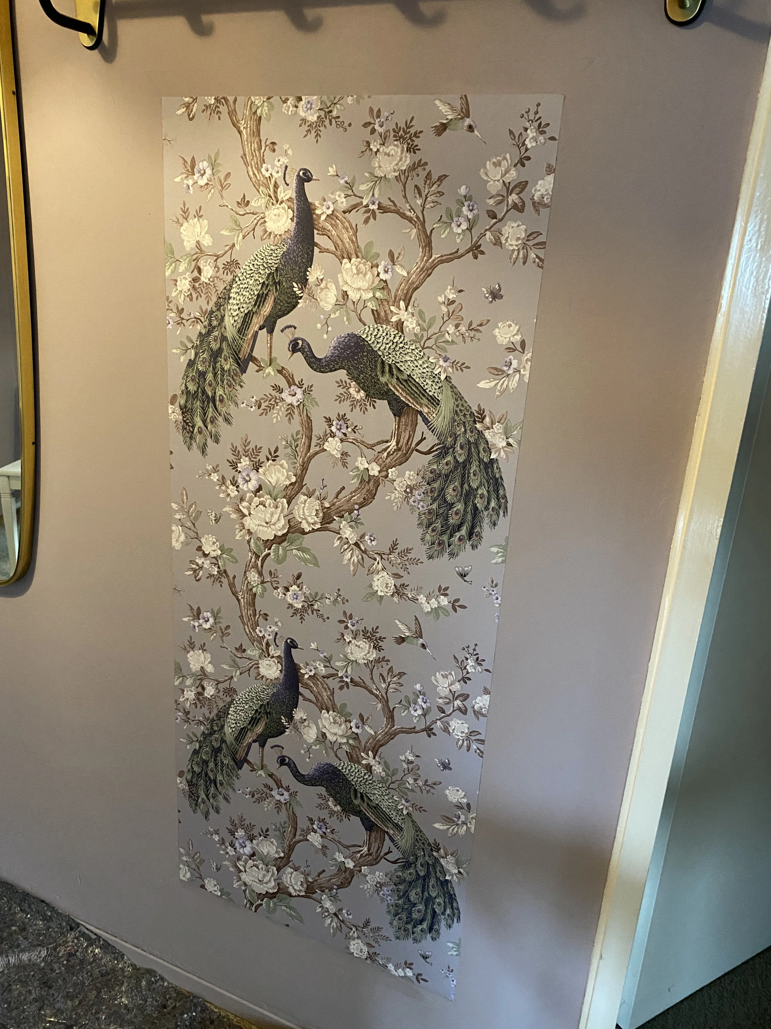
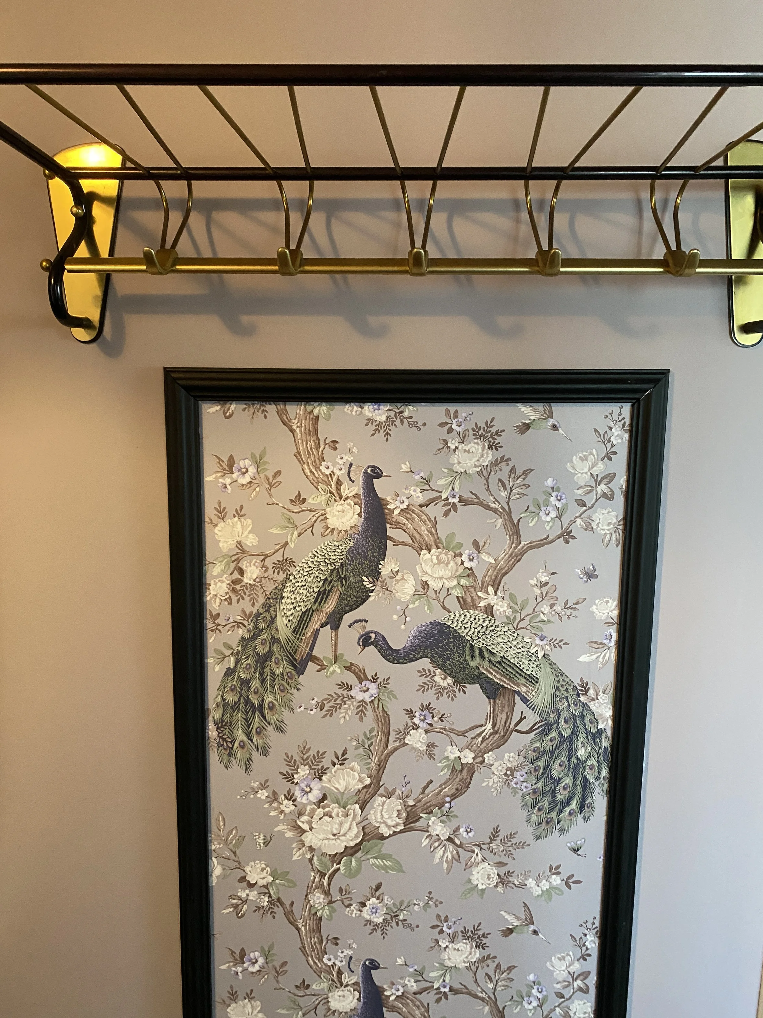
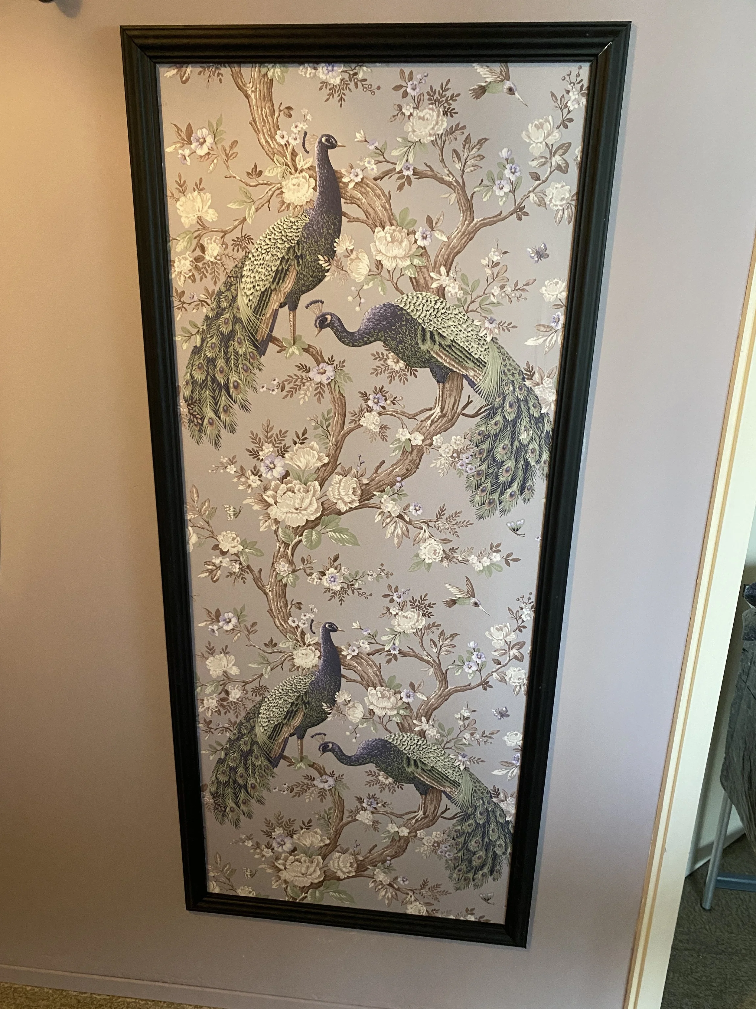
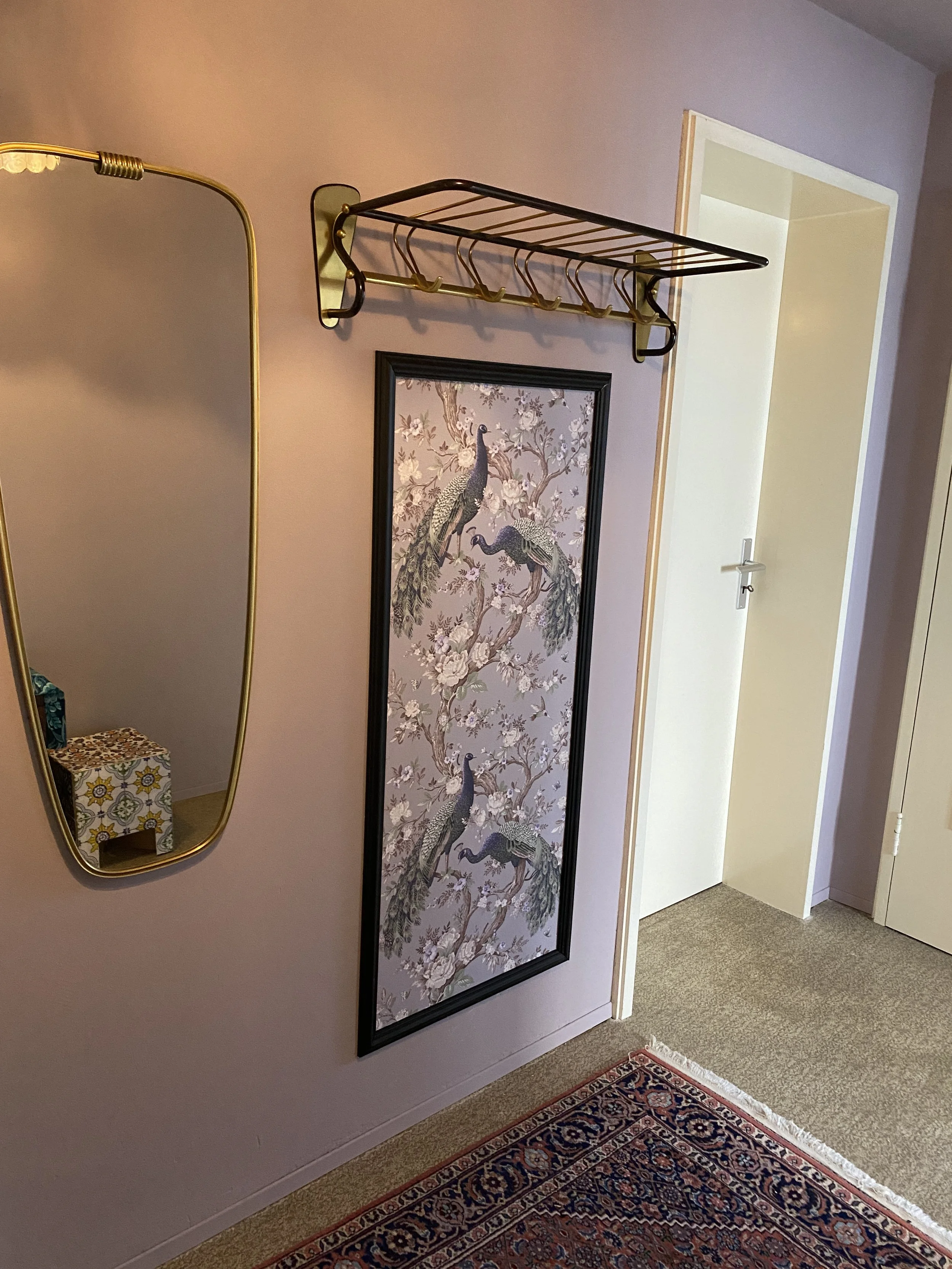
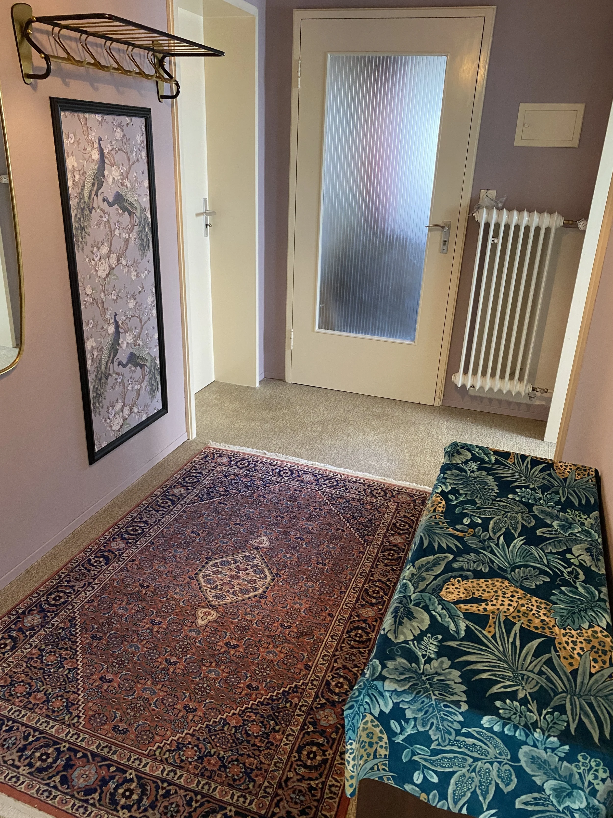
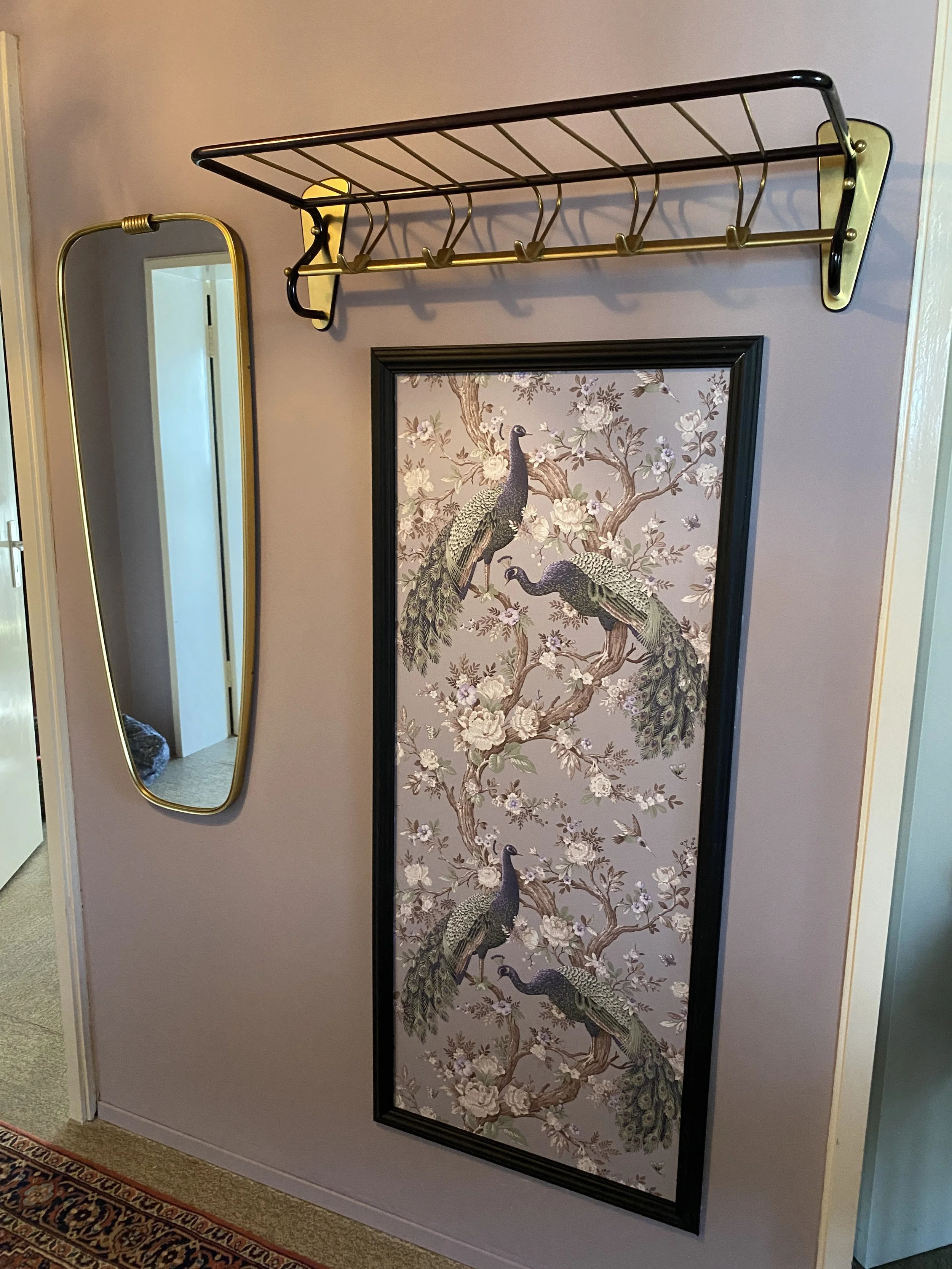
The Hallway
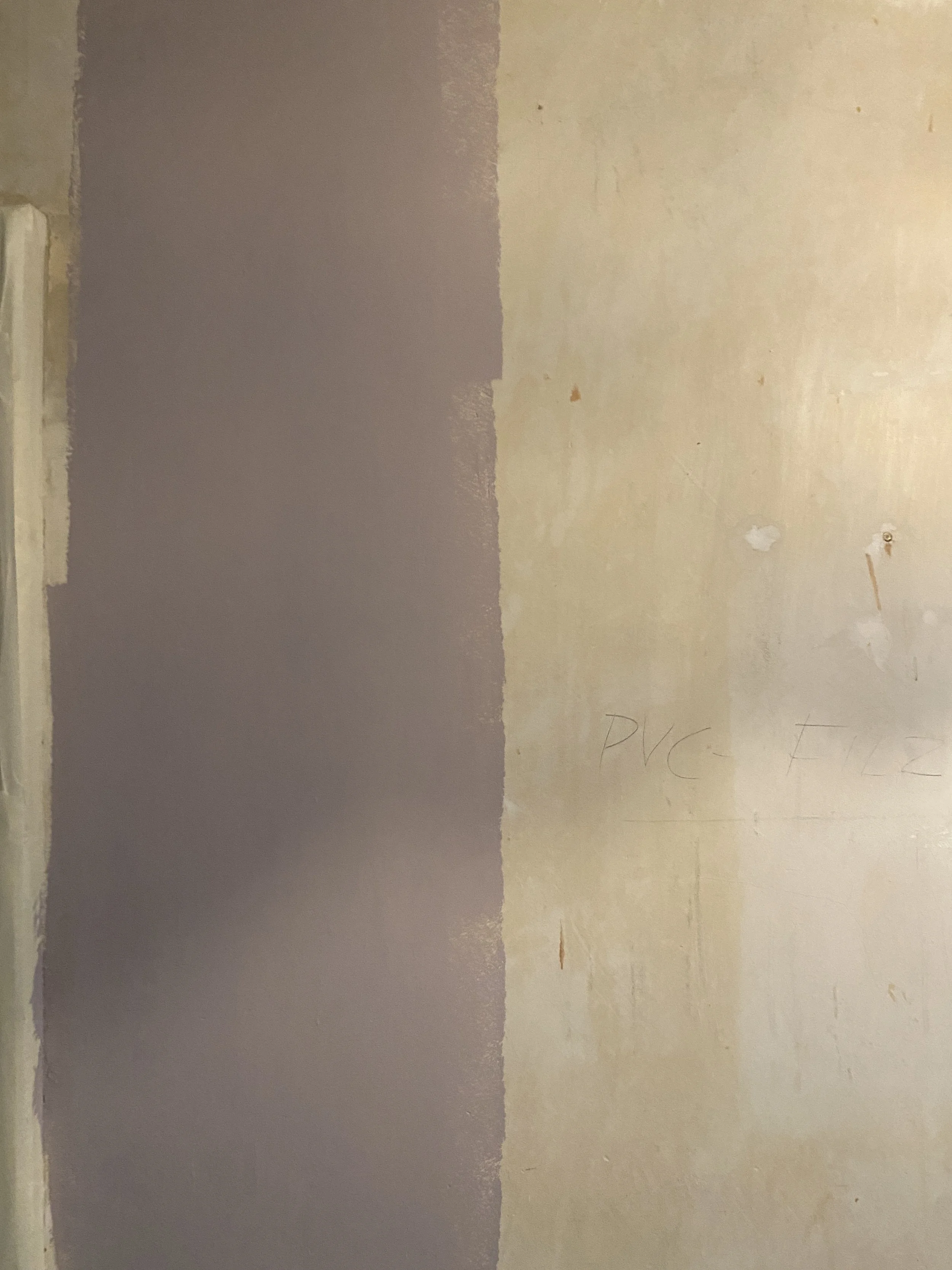
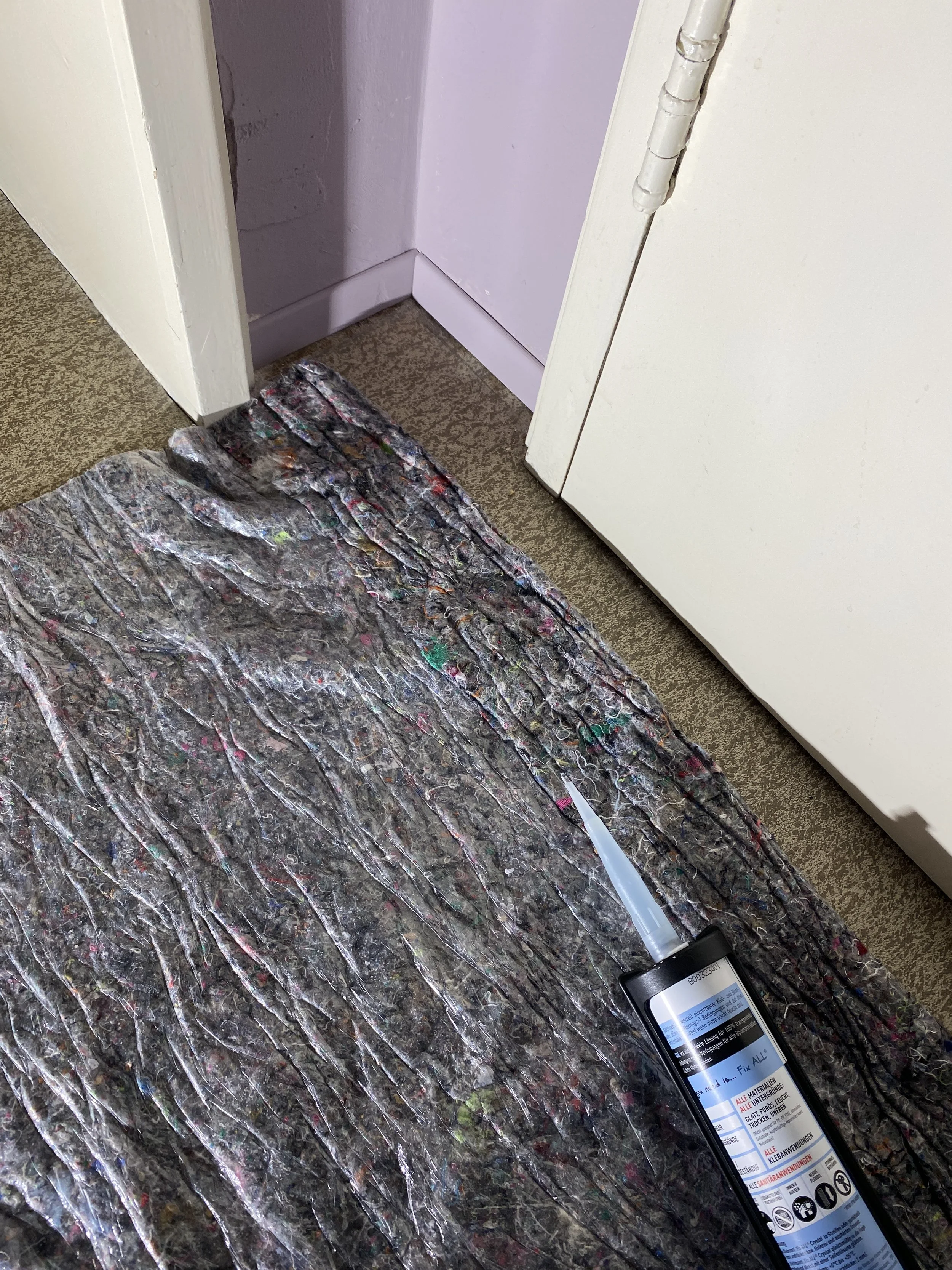
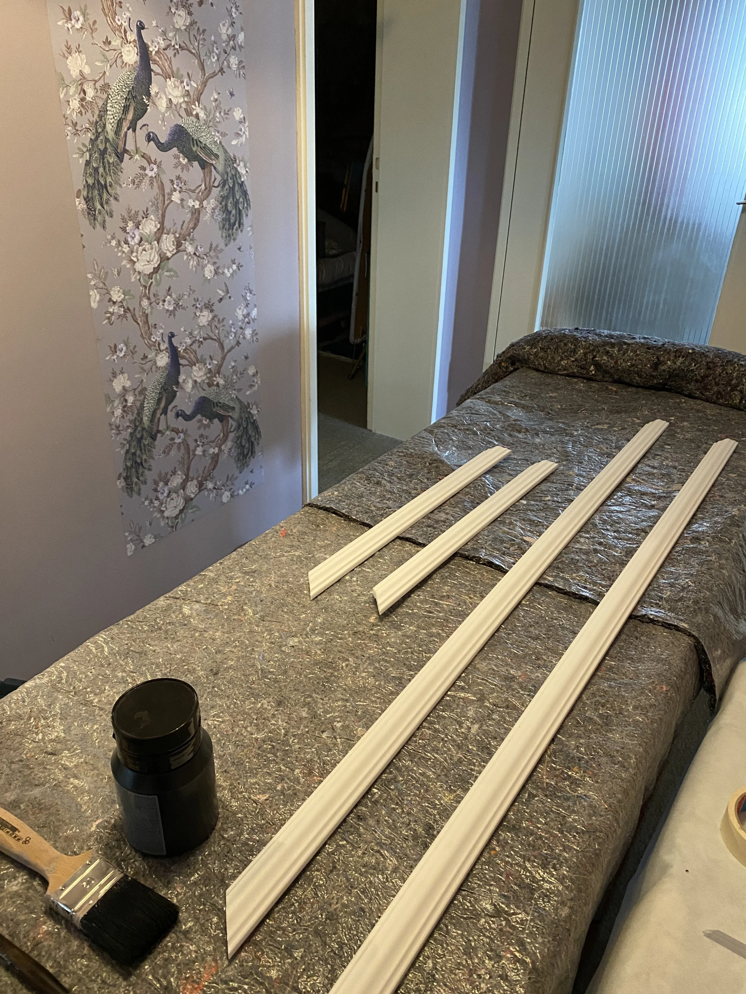
Redoing the hallway was the biggest hurdle of this project. The hallway was very old and the wallpaper came right off with water and soap. A big challenge was preparing the wall and making sure that it was smooth for the paint. I recommend using a simple underground preparer to stop the wall from soaking up too much paint. Afterwards use simple filler to smooth out the little holes - later you will hardly see it with two layers of paint. To keep the old English style I went for a dusty rose purple pink and asked the paint section at the store to add a tiny bit of white to make it even more dusty since the hallway doesn’t hardly have any natural light coming in so it is cannot be too dark!
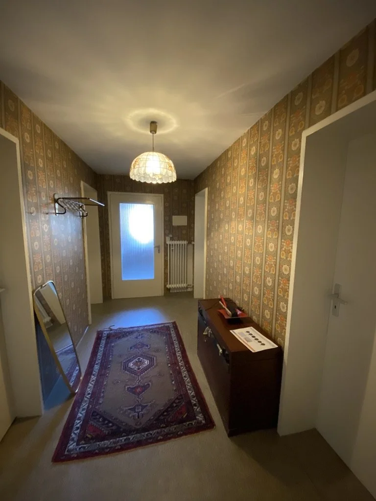
Before..
As much as I am a fan of vintage wallpaper, this 60s wallpaper has served many years and it was time for something else. It made the hallway look small and crowded.
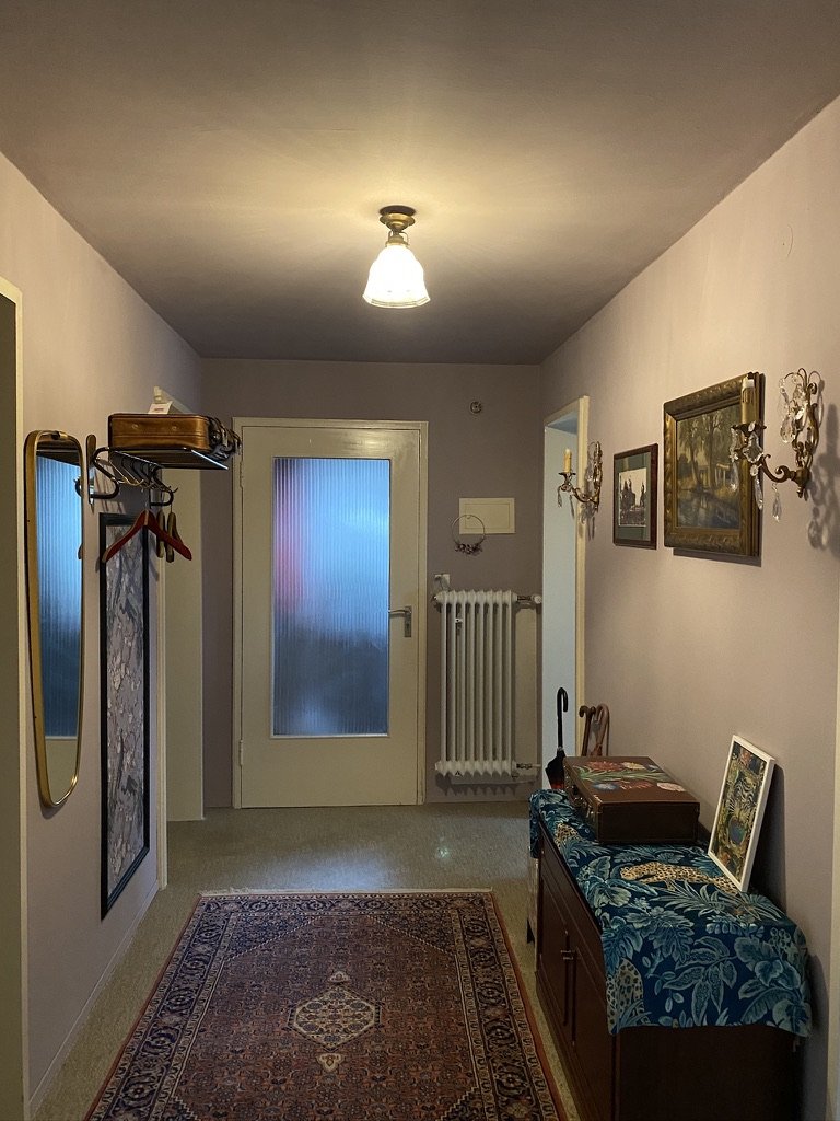
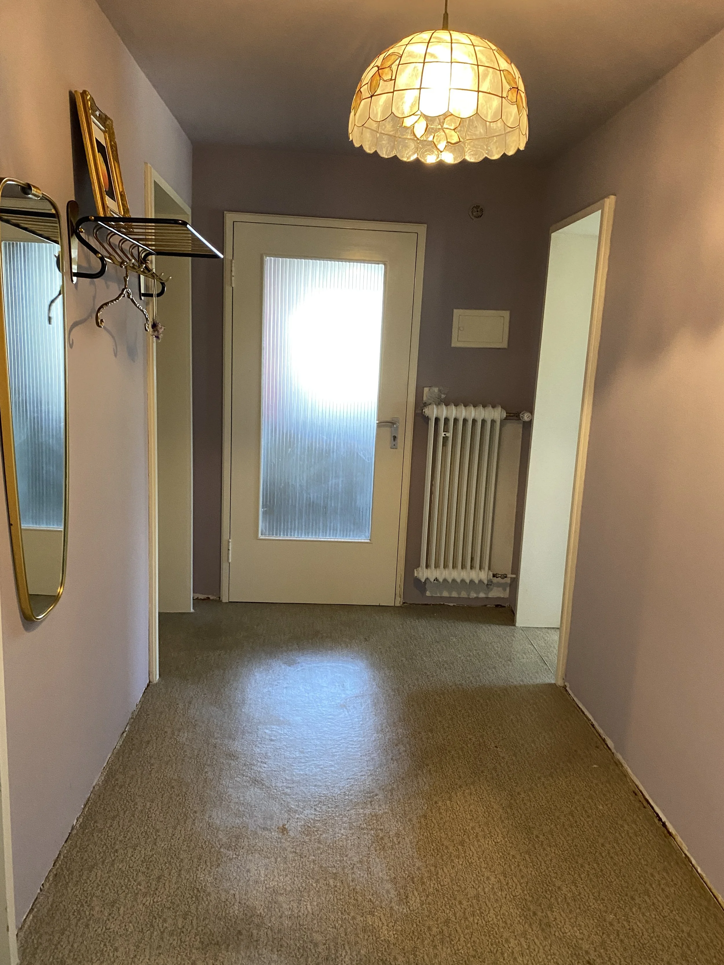
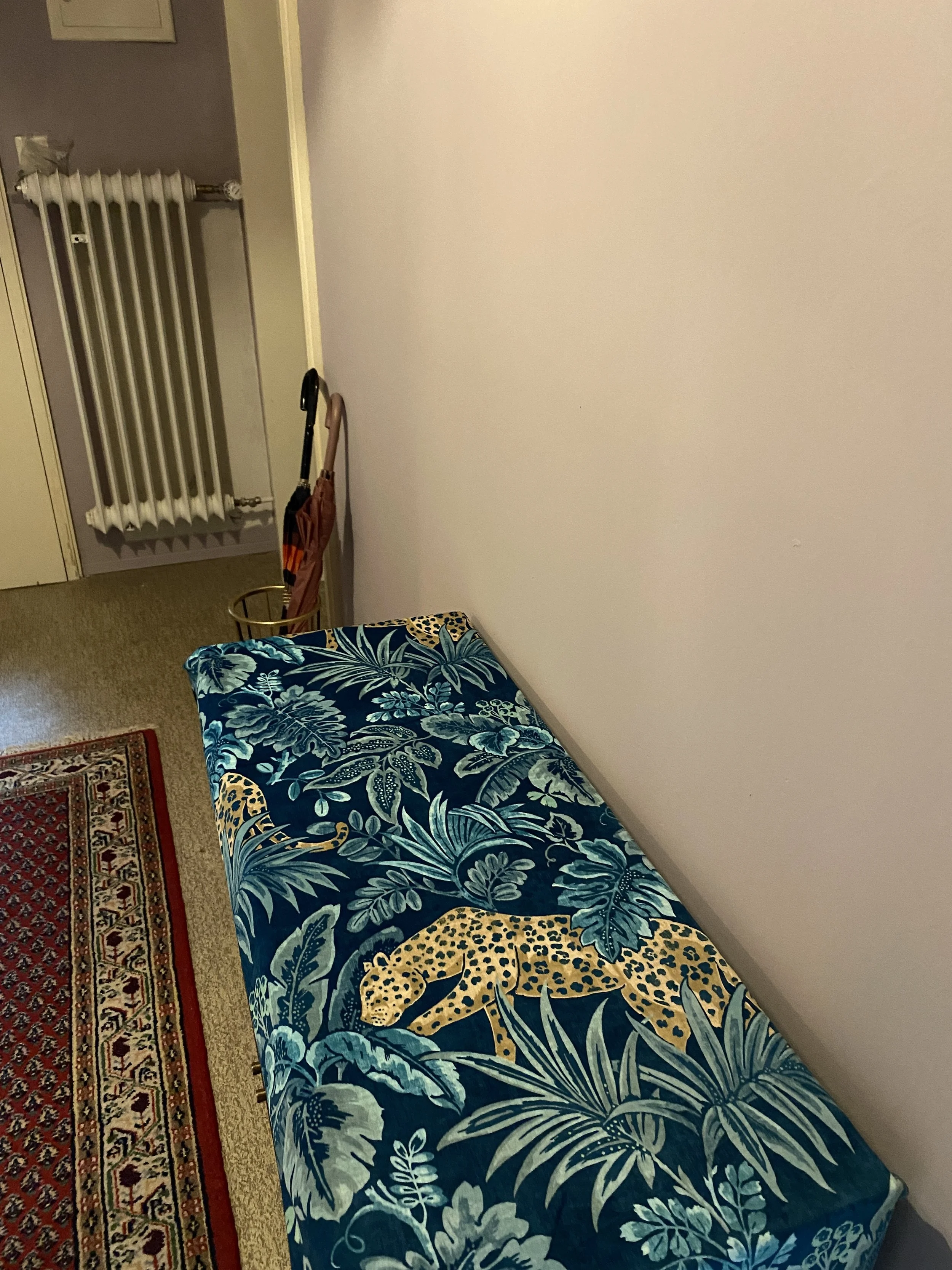
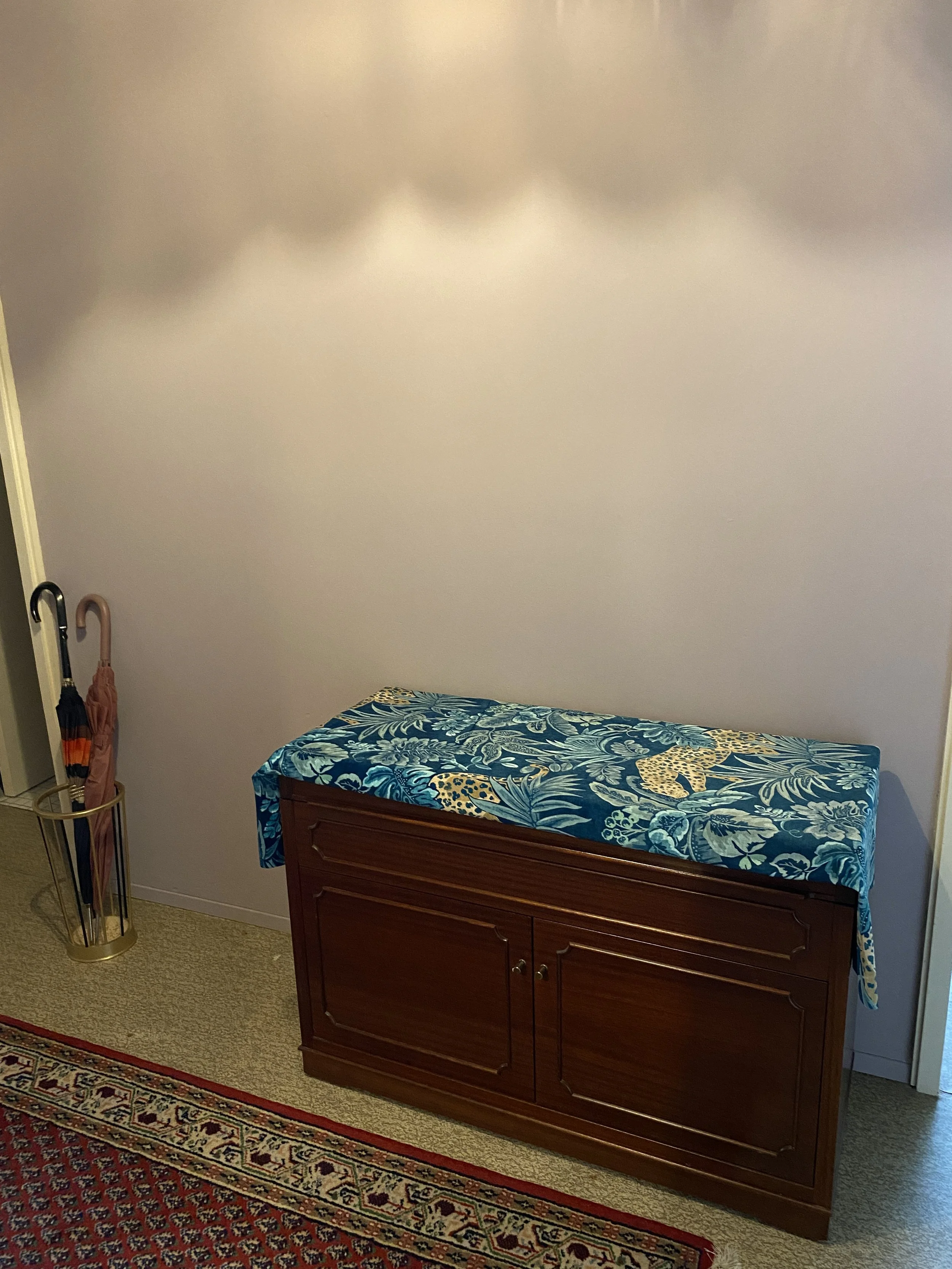
After…
I completed the look with some beautiful vintage wall candle lamps I found at the local art and antique market and I had this stylish jungle fabric left over which breaks the old traditional style just a tiny bit.
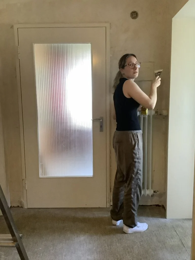
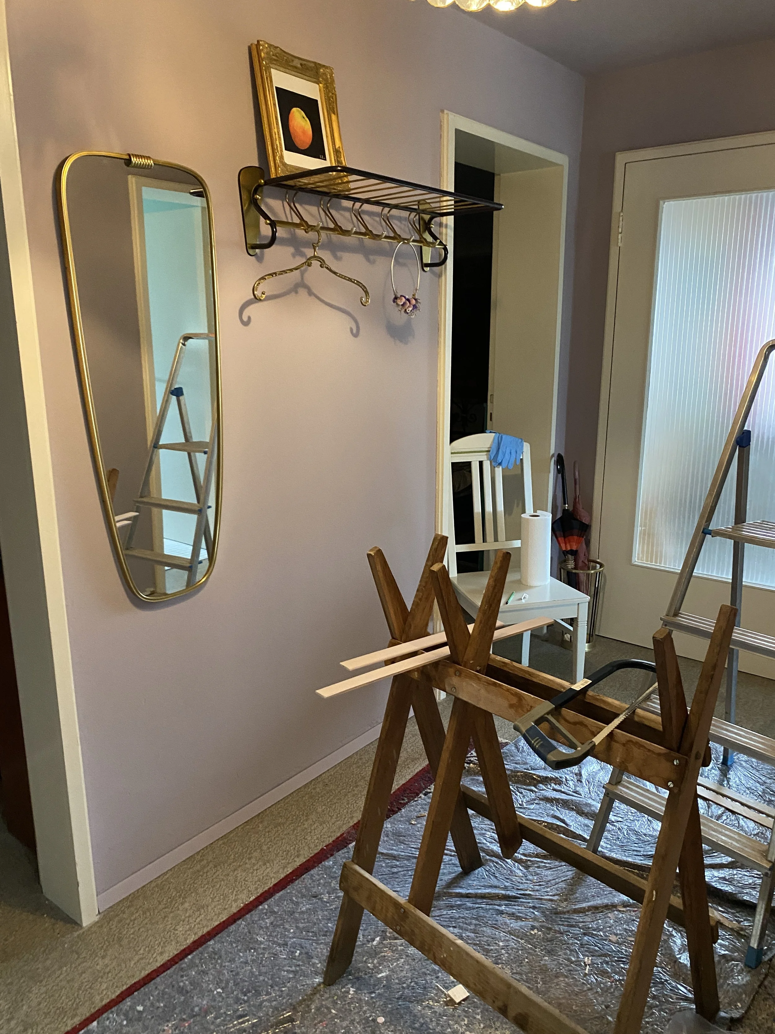
Surprise photo
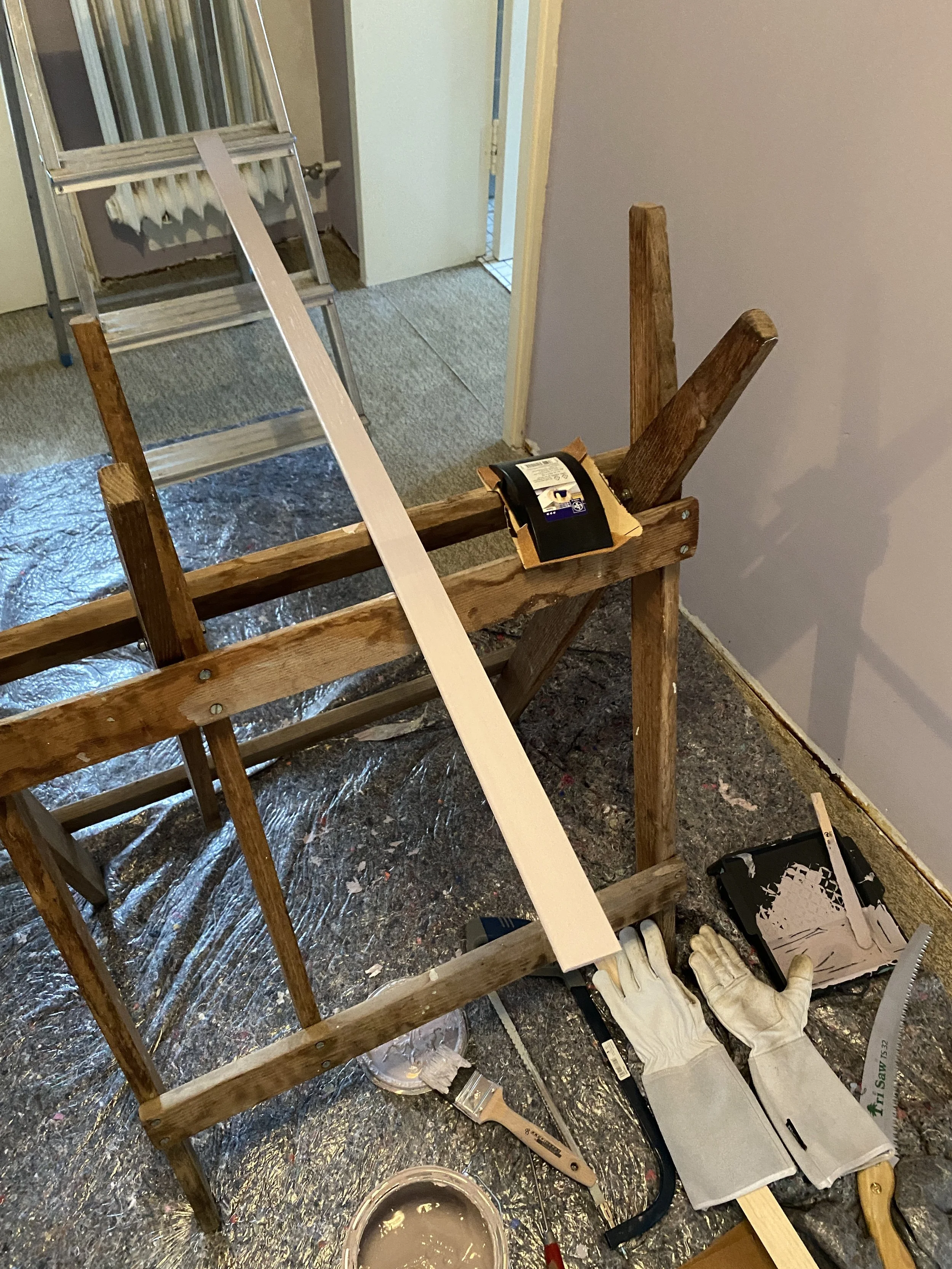
In case anyone needs proof of my hard work and dedication here I am haha. At this point I have to admit I was a bit struggling and cursing at the wall for being so bumpy since I had to smooth out many holes with kitt but it was all worth it.
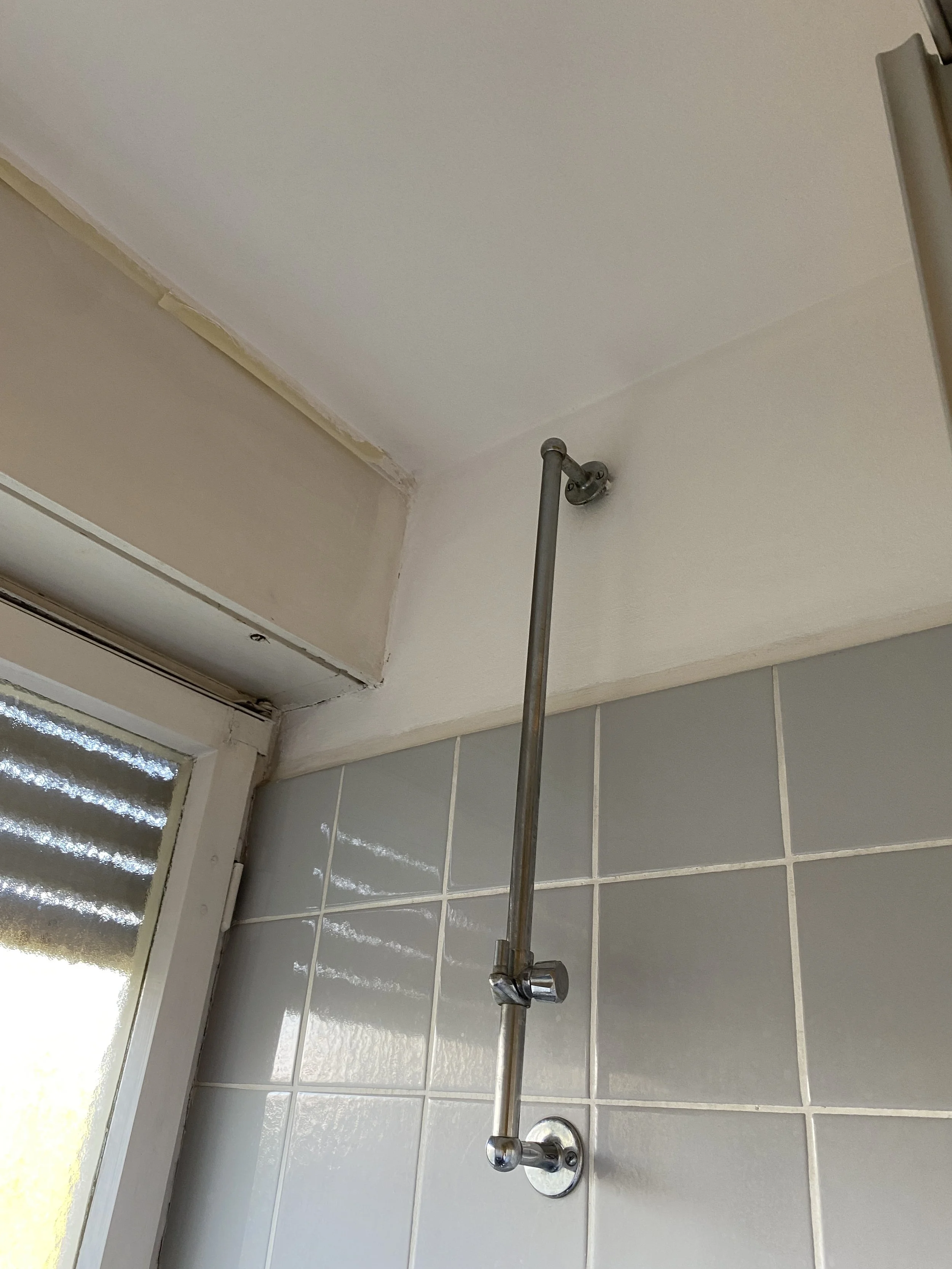
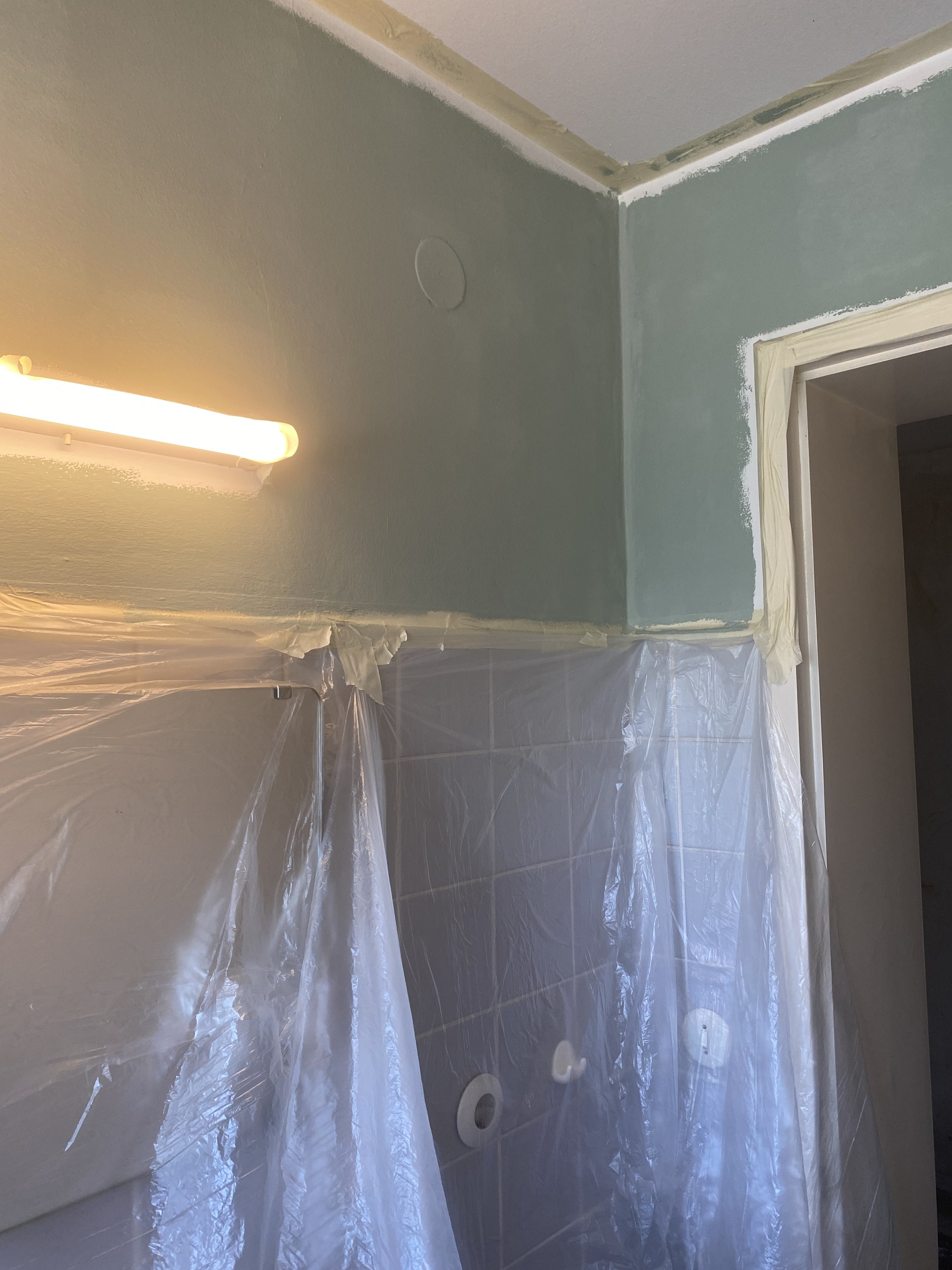
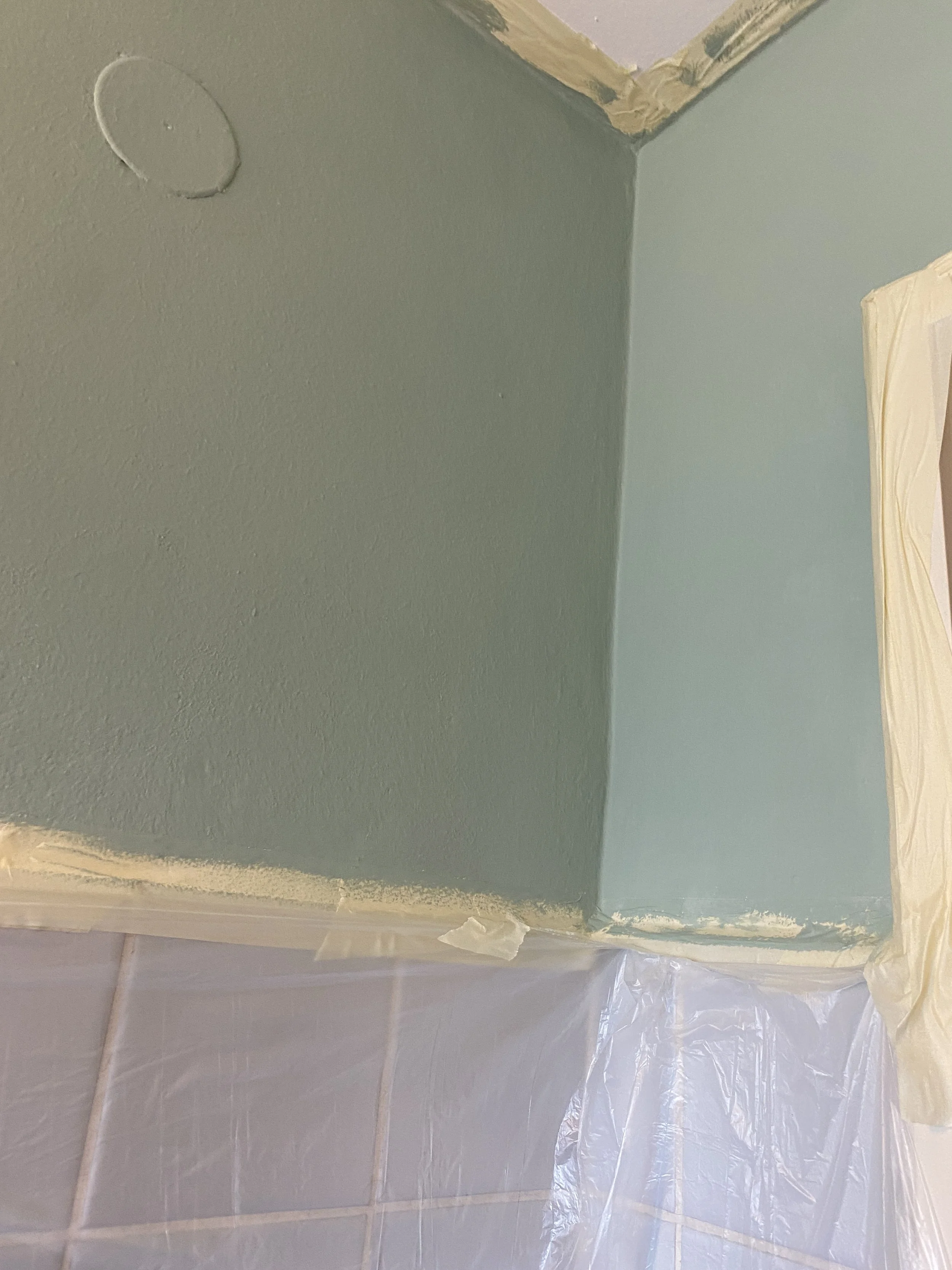
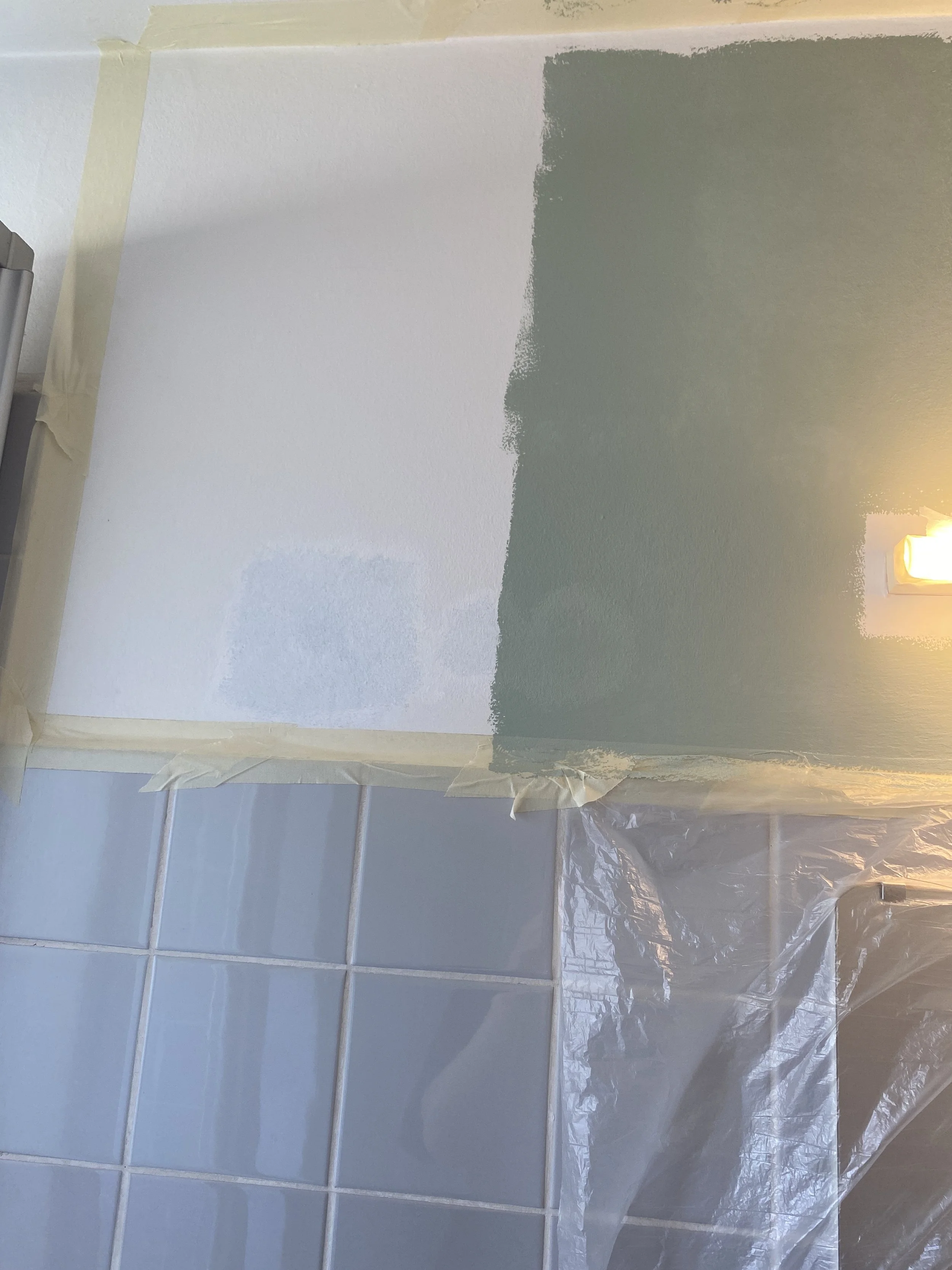
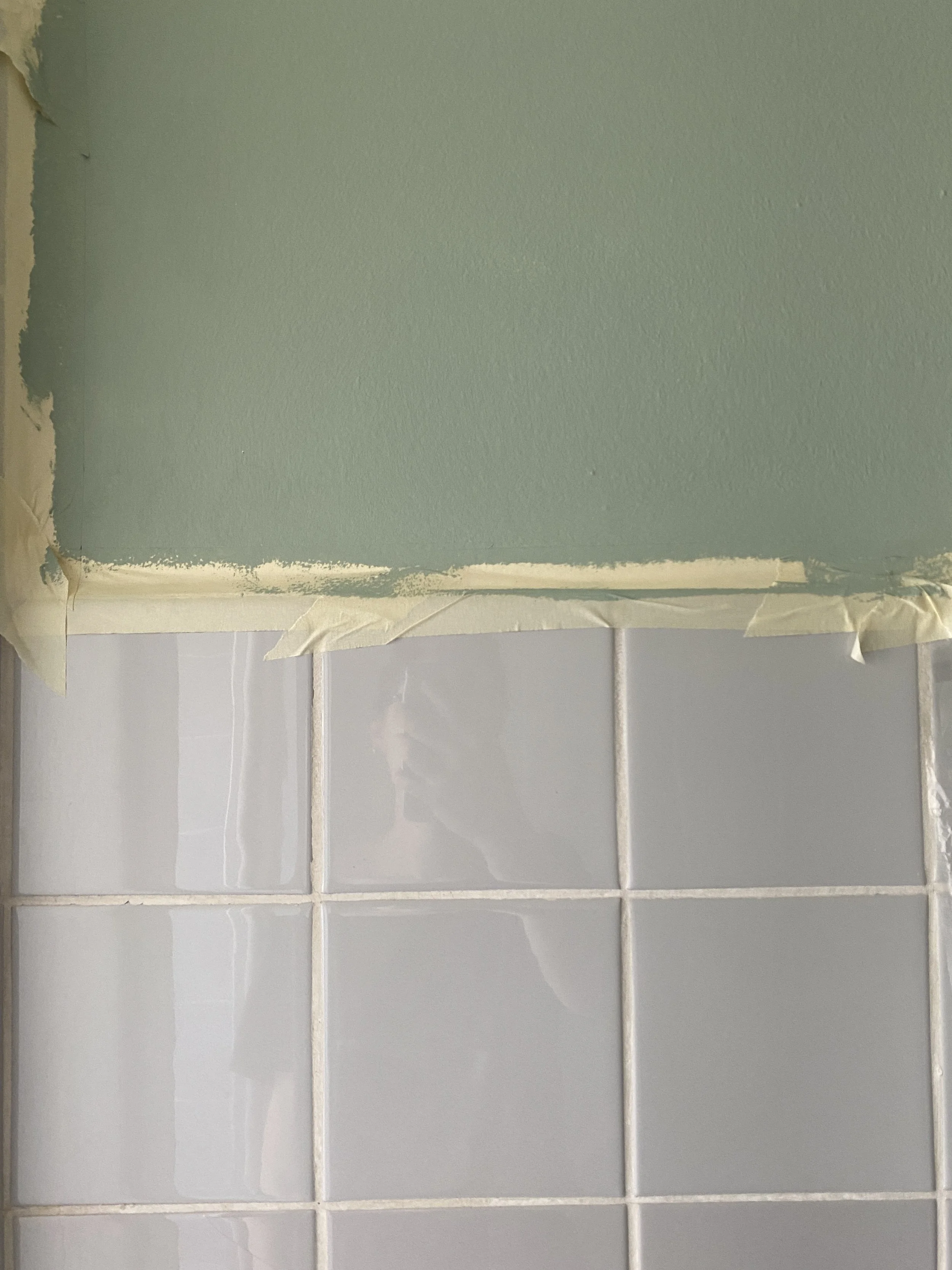
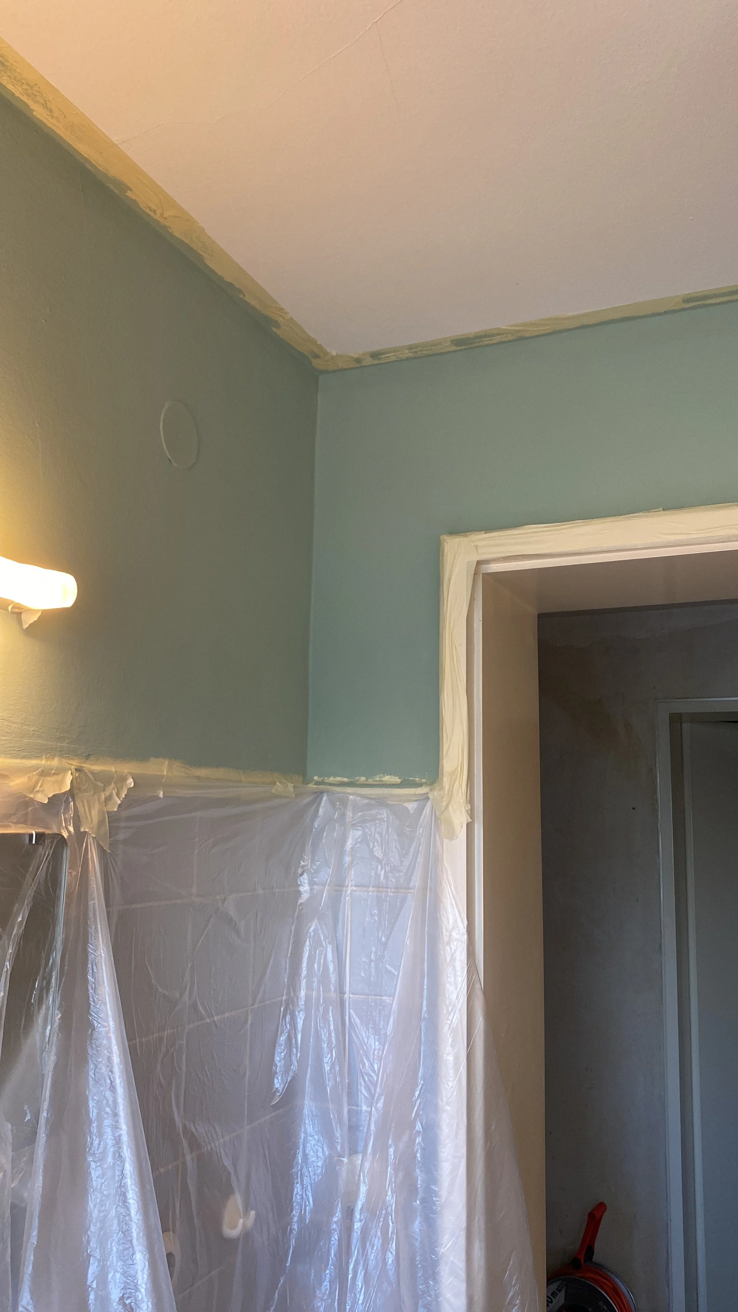
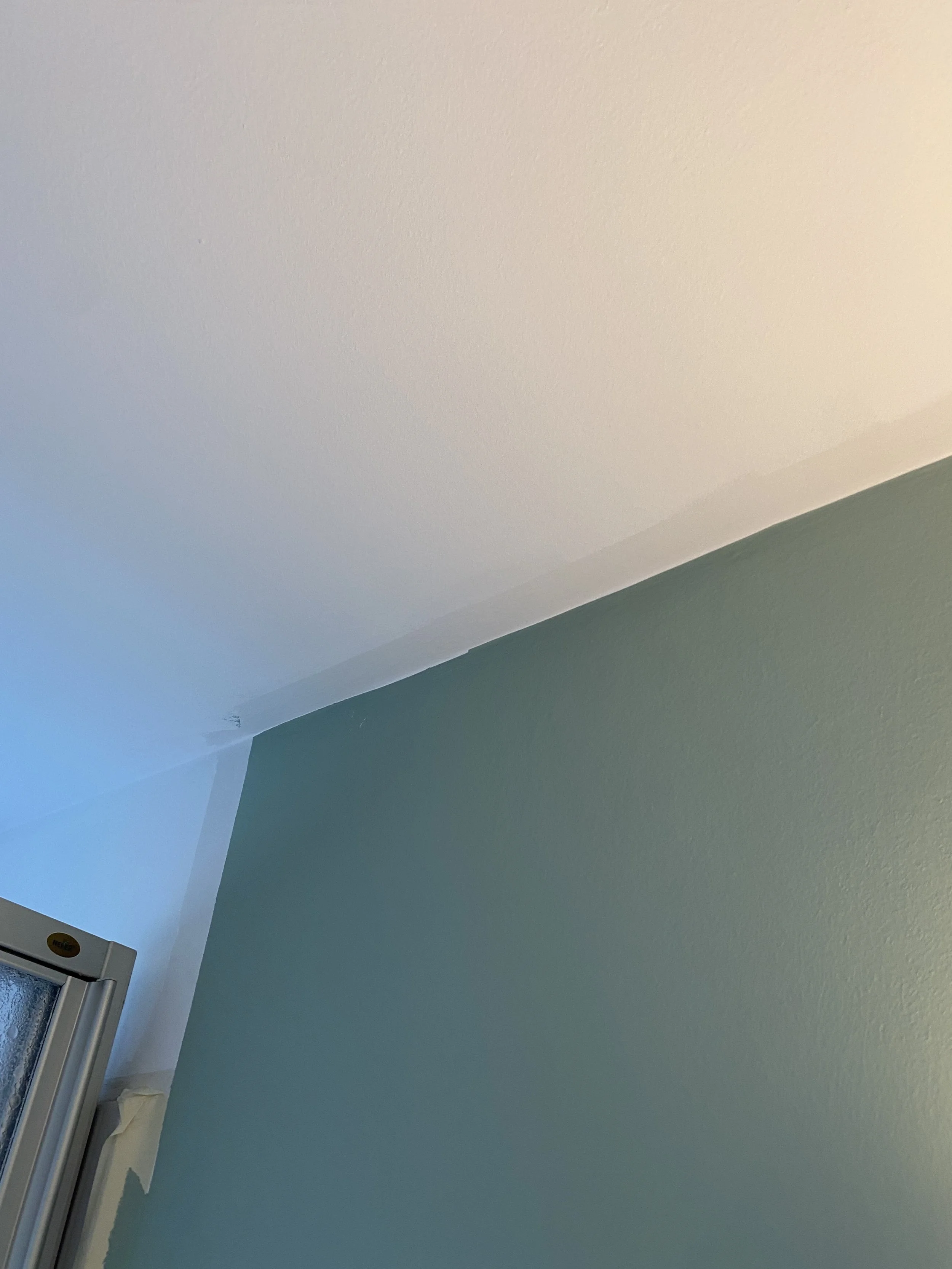
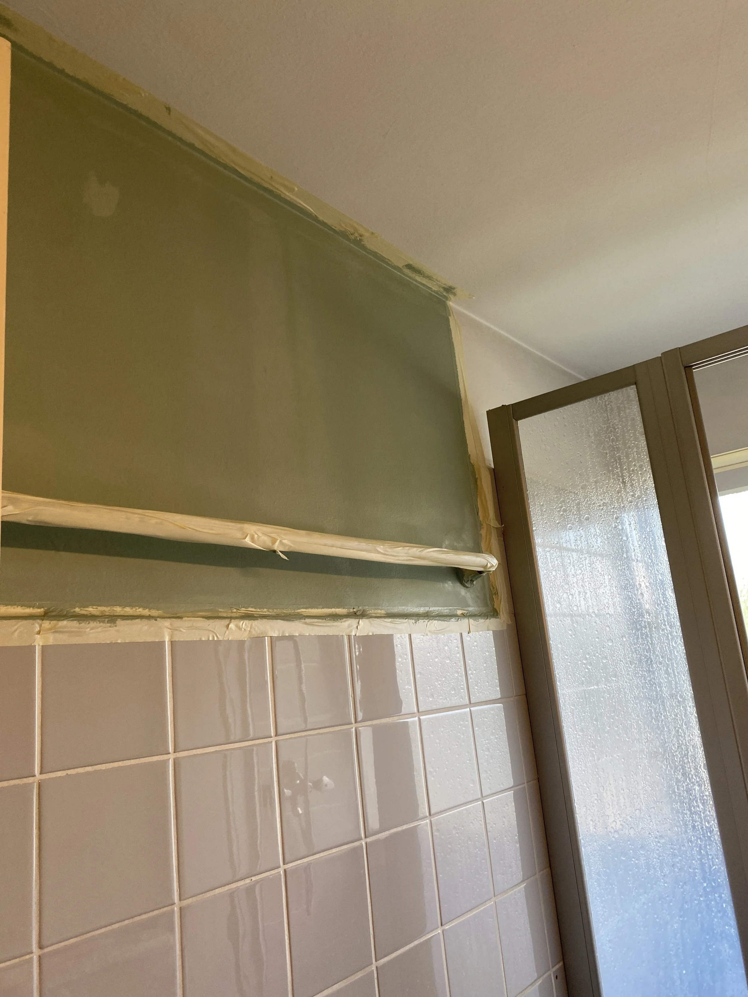
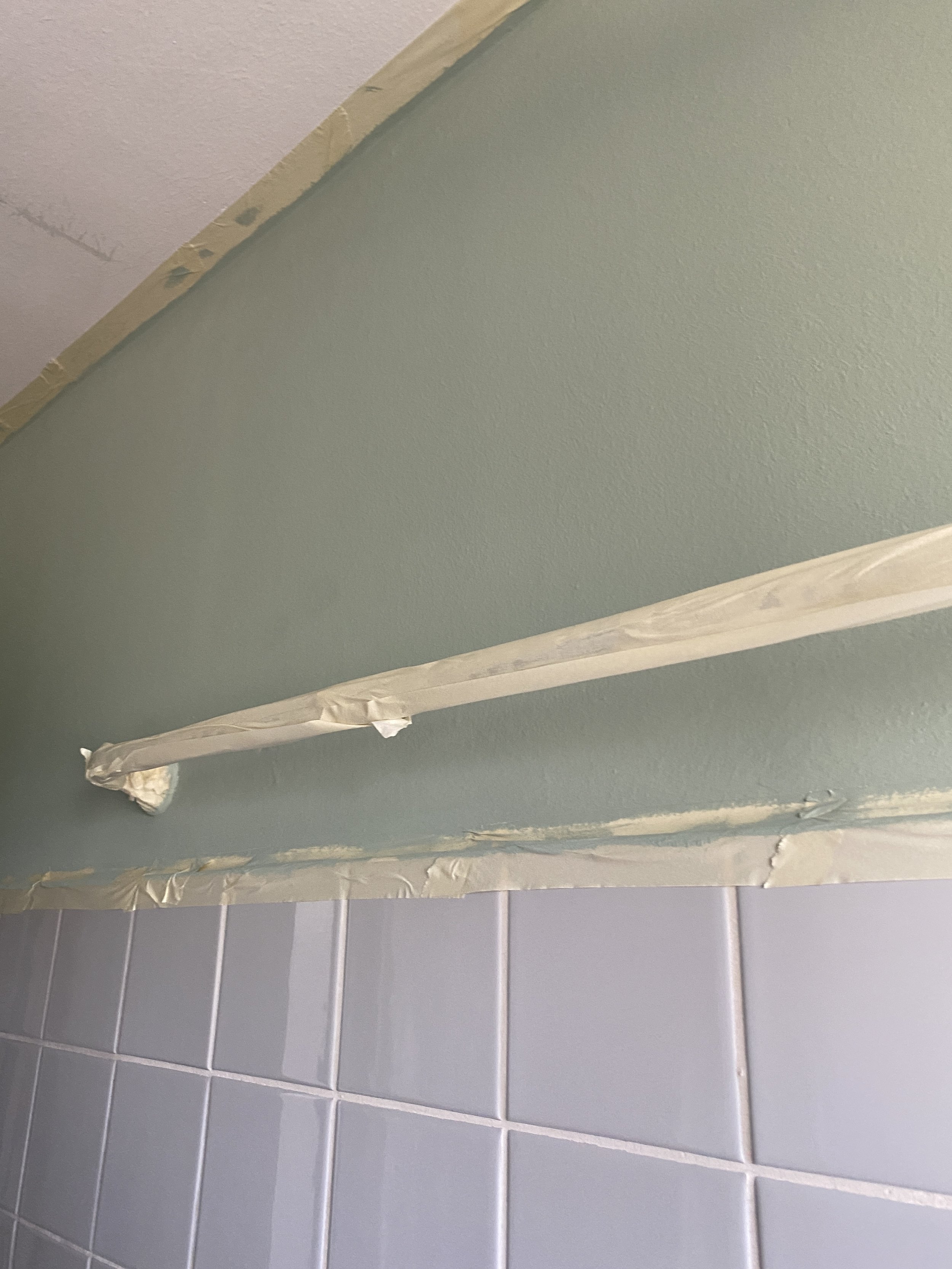
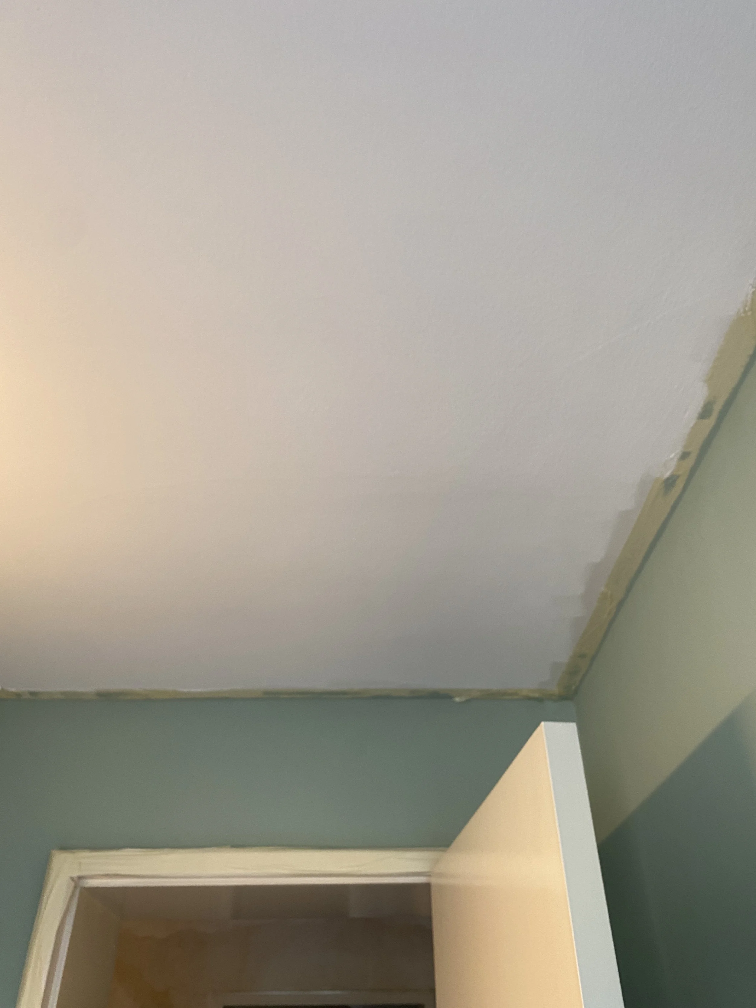
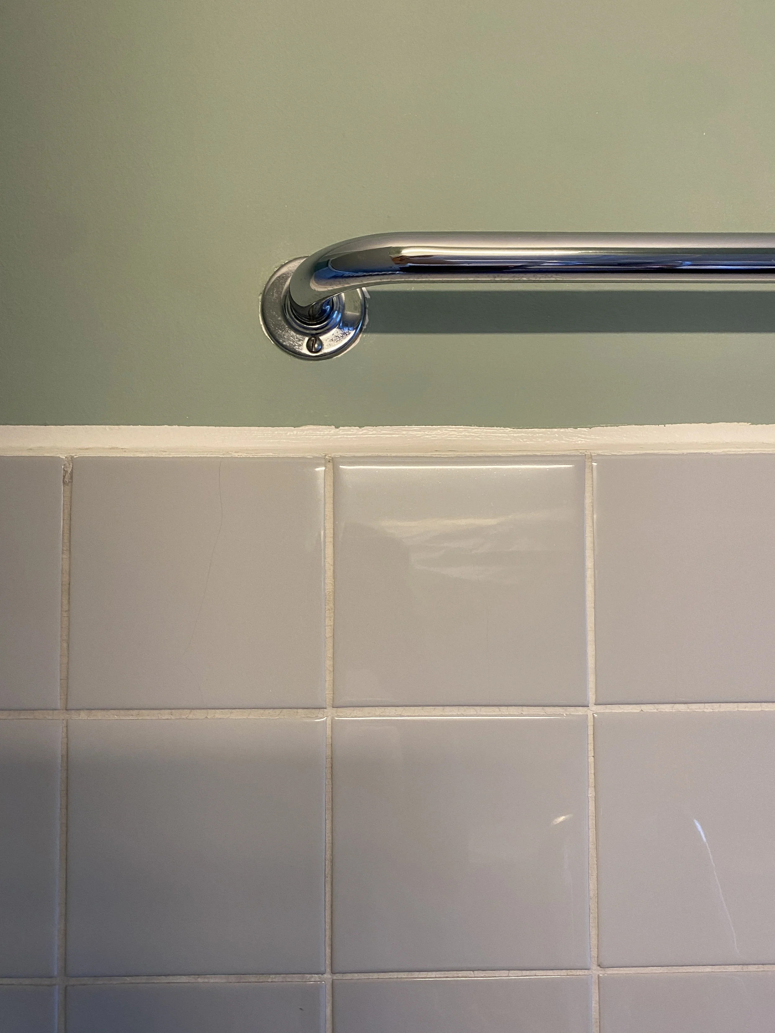
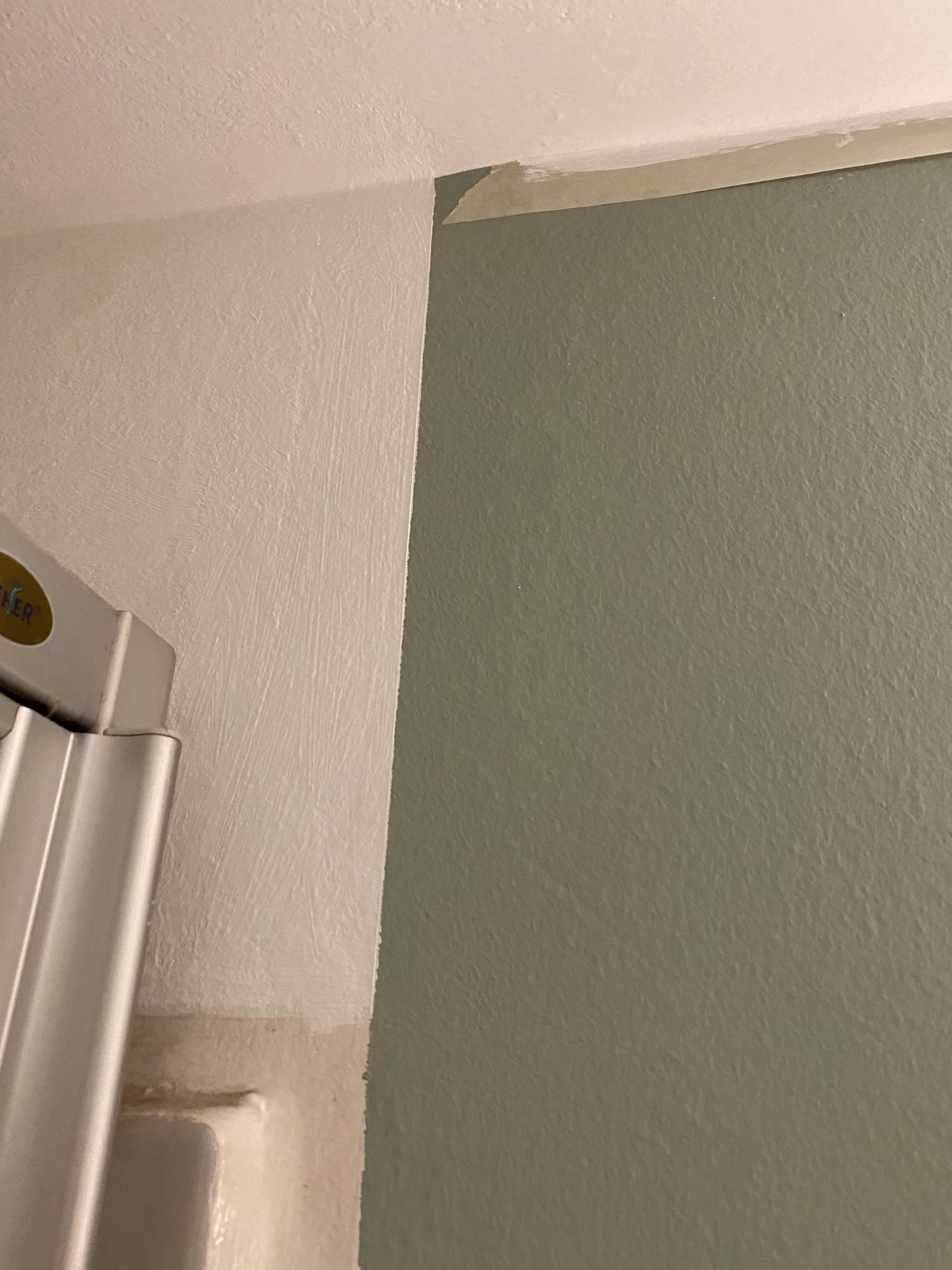
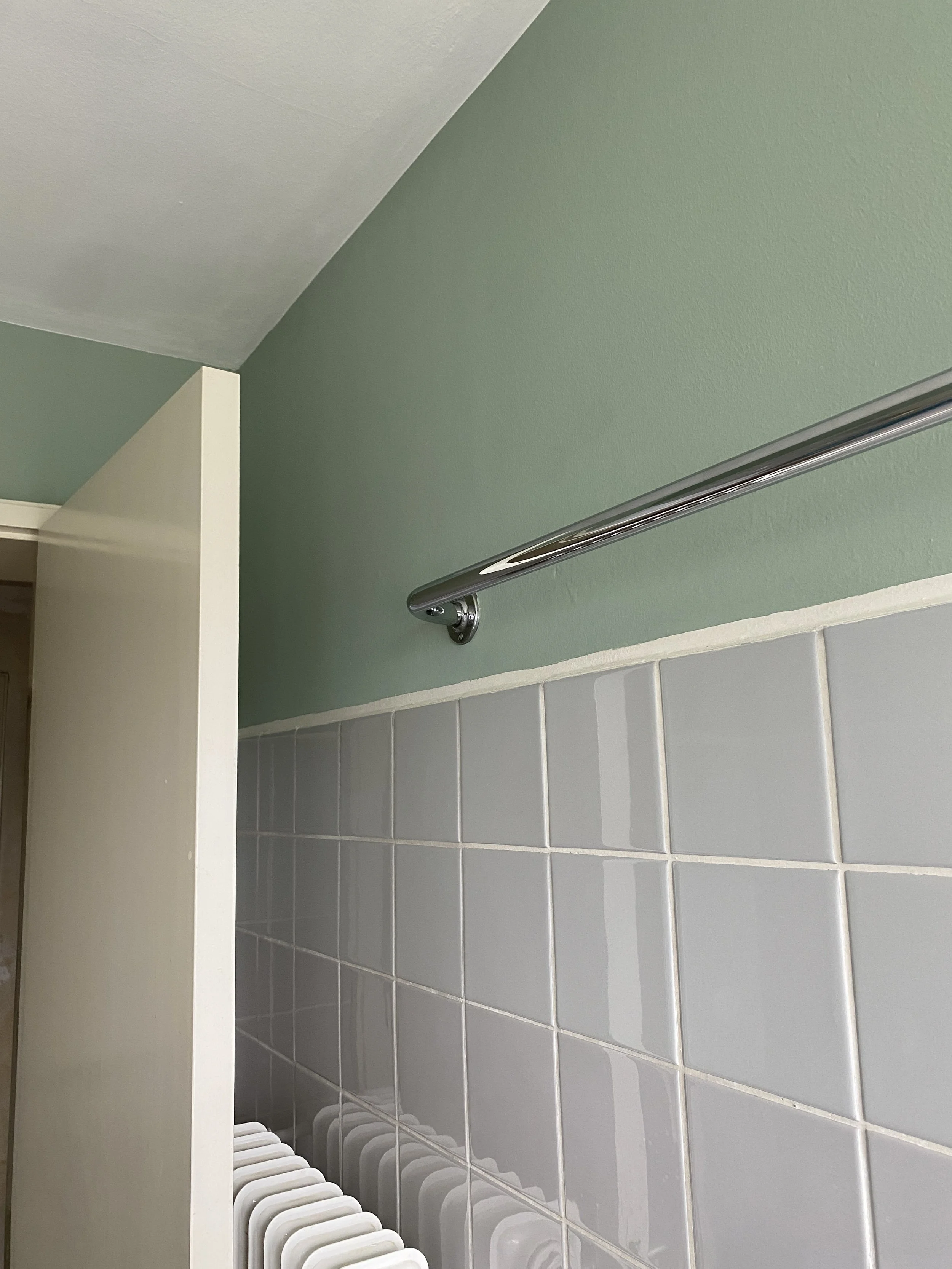
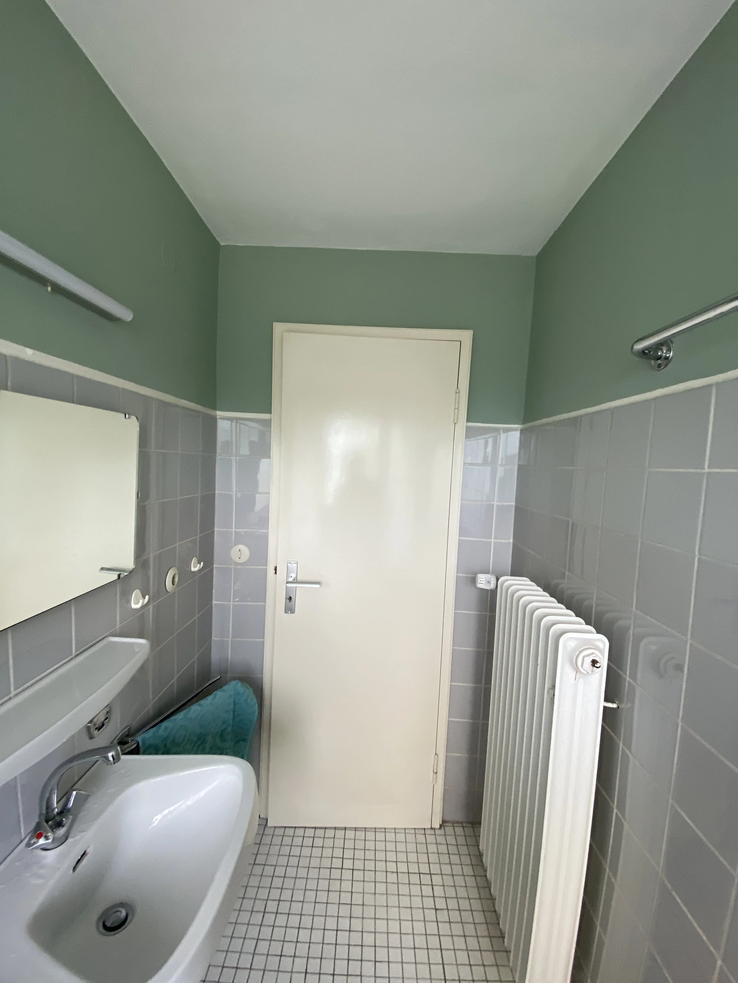
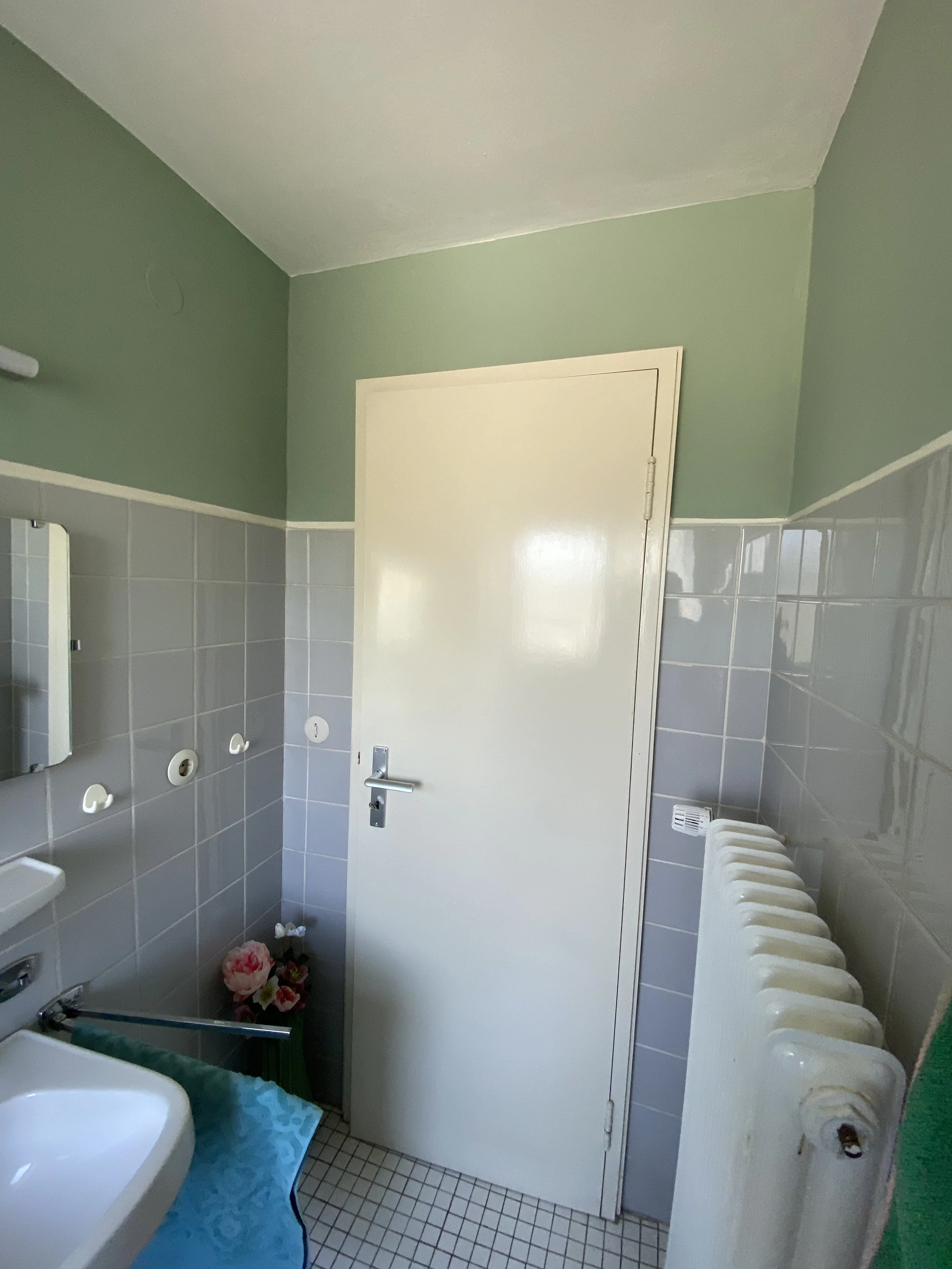
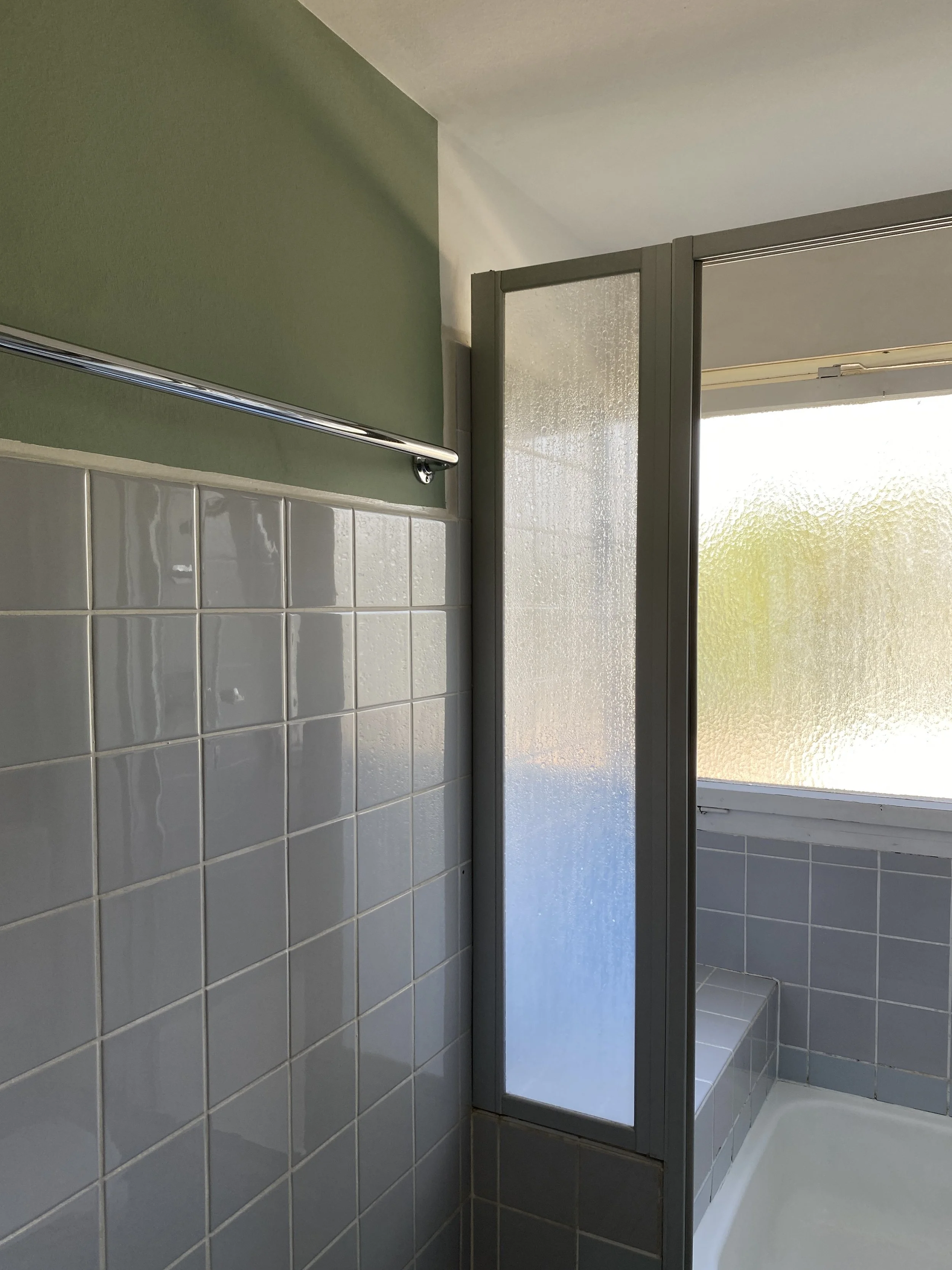
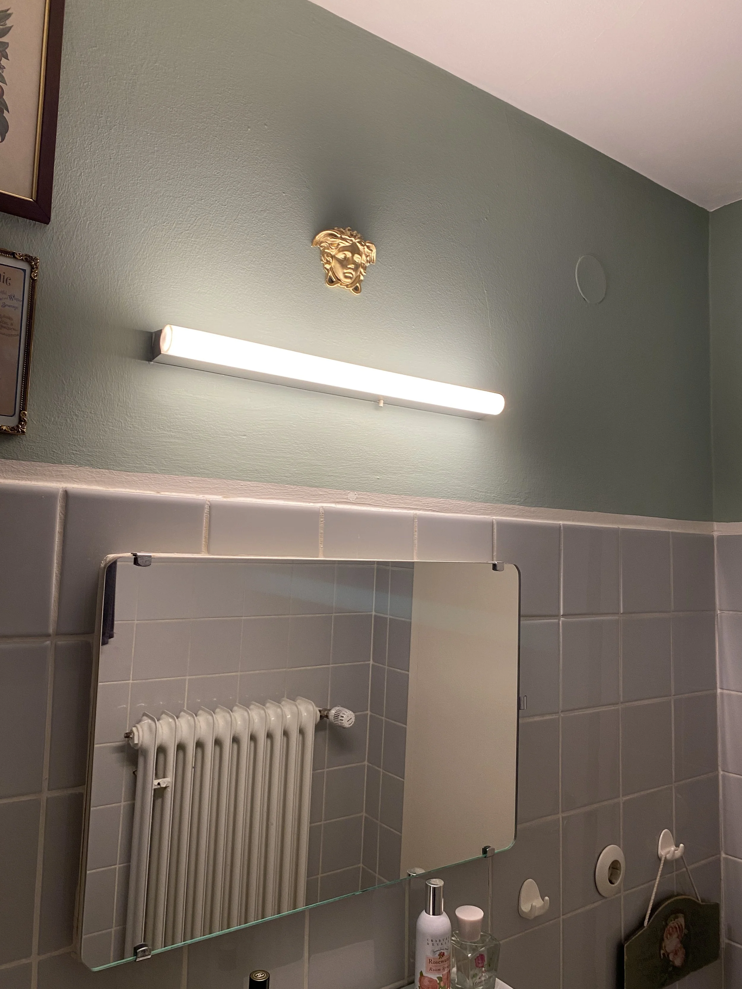
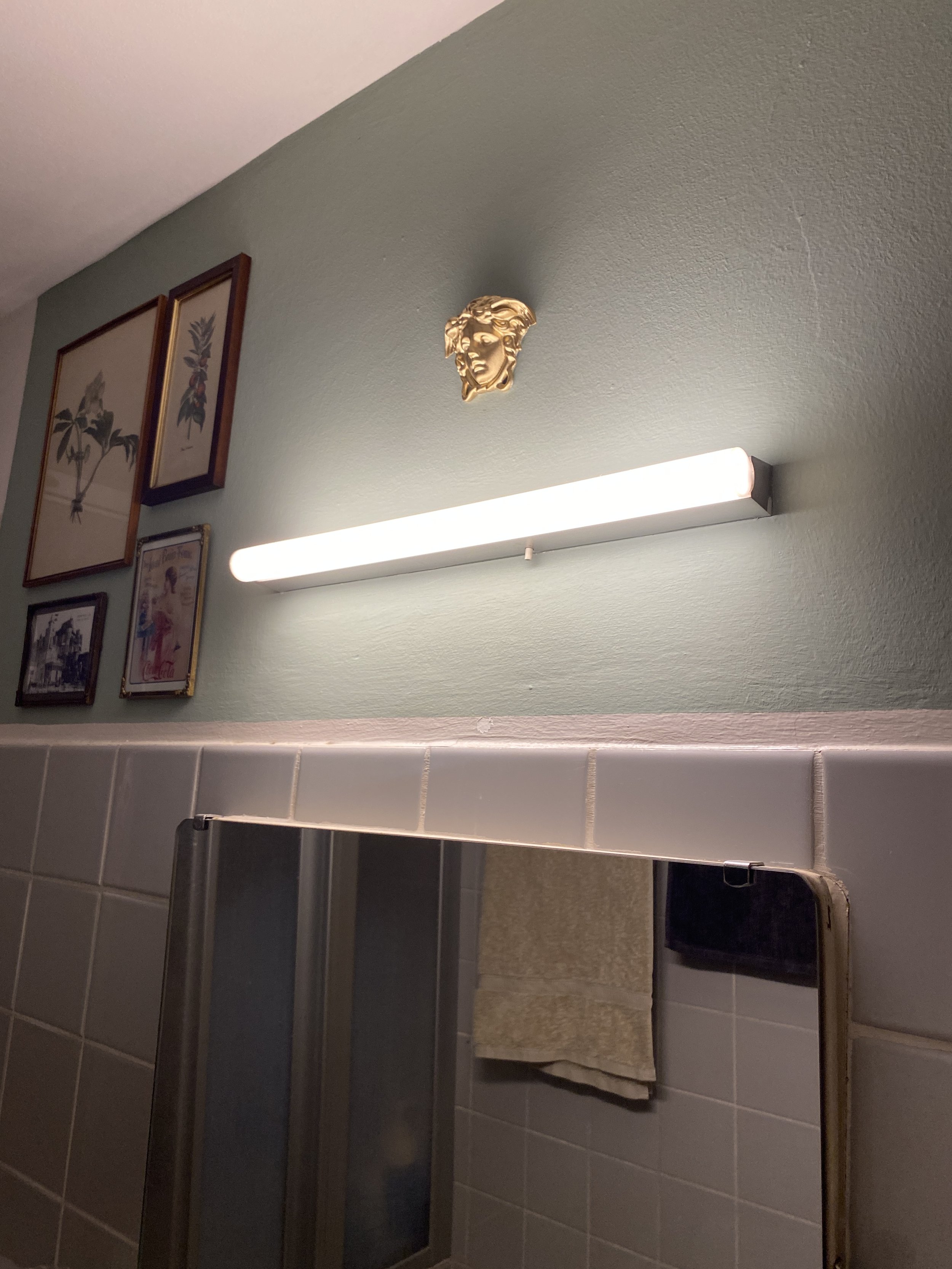
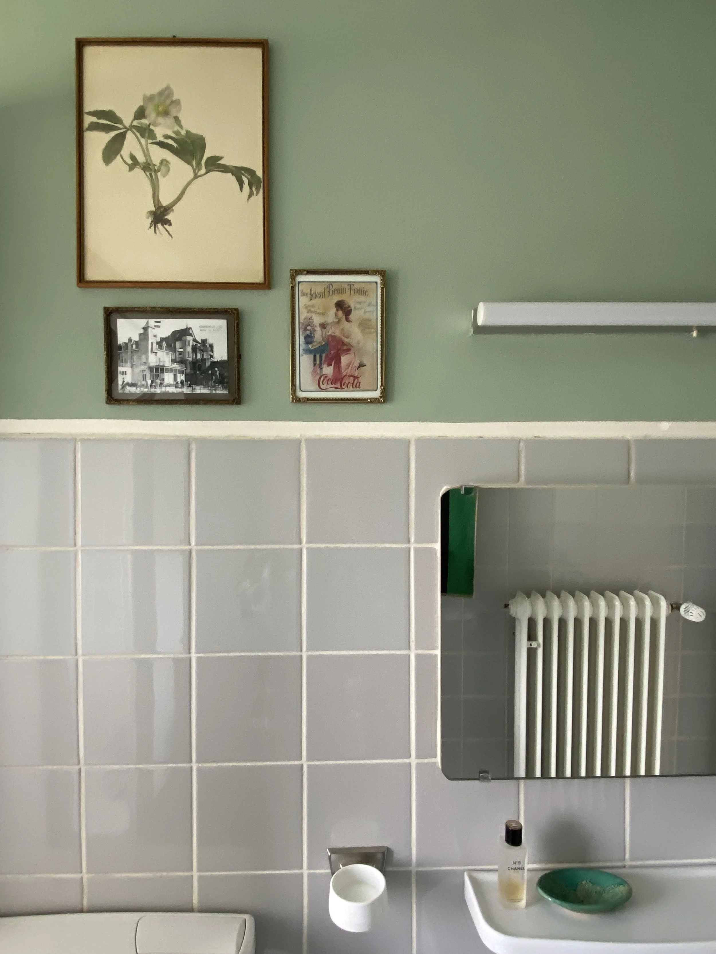
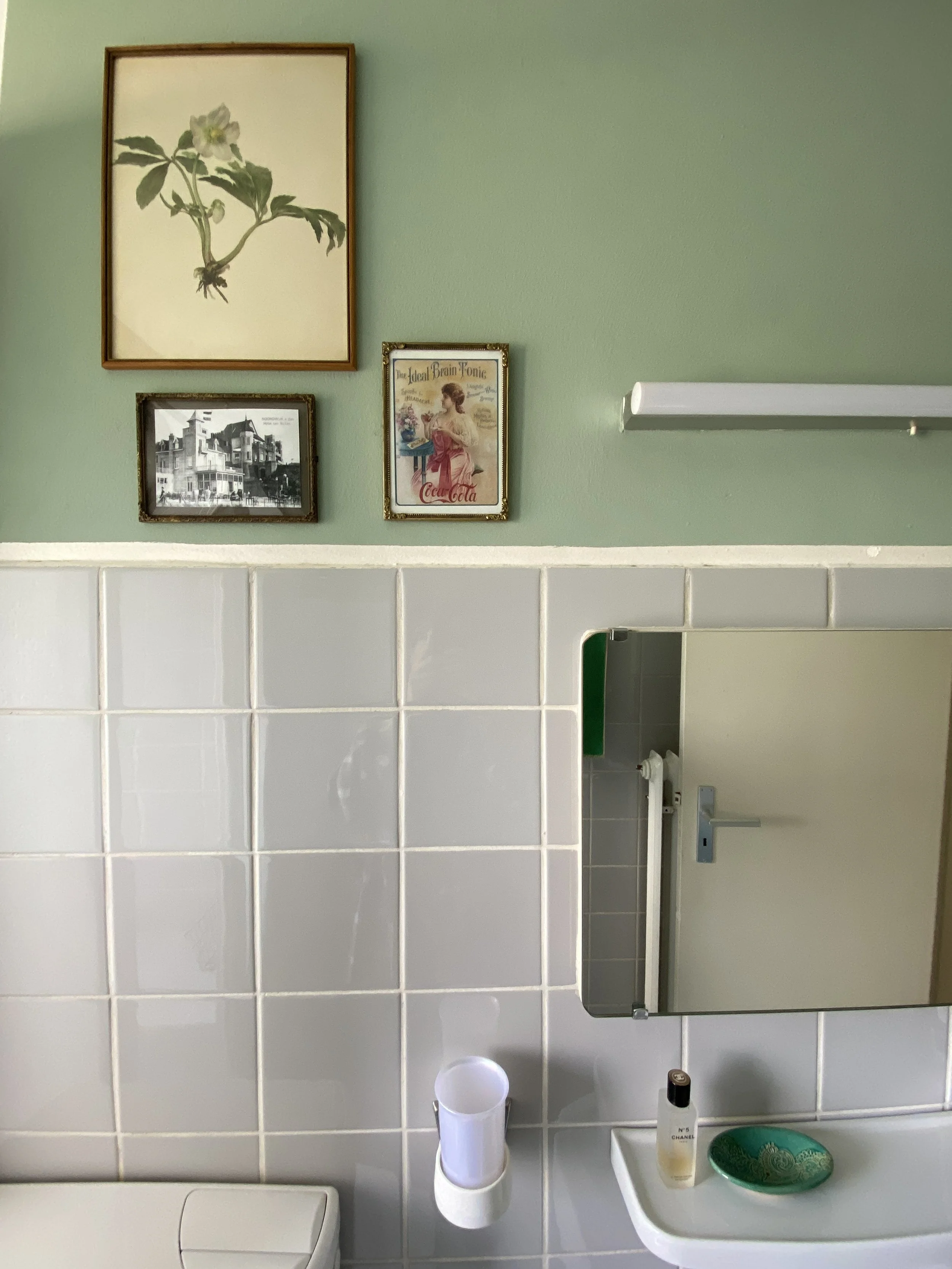
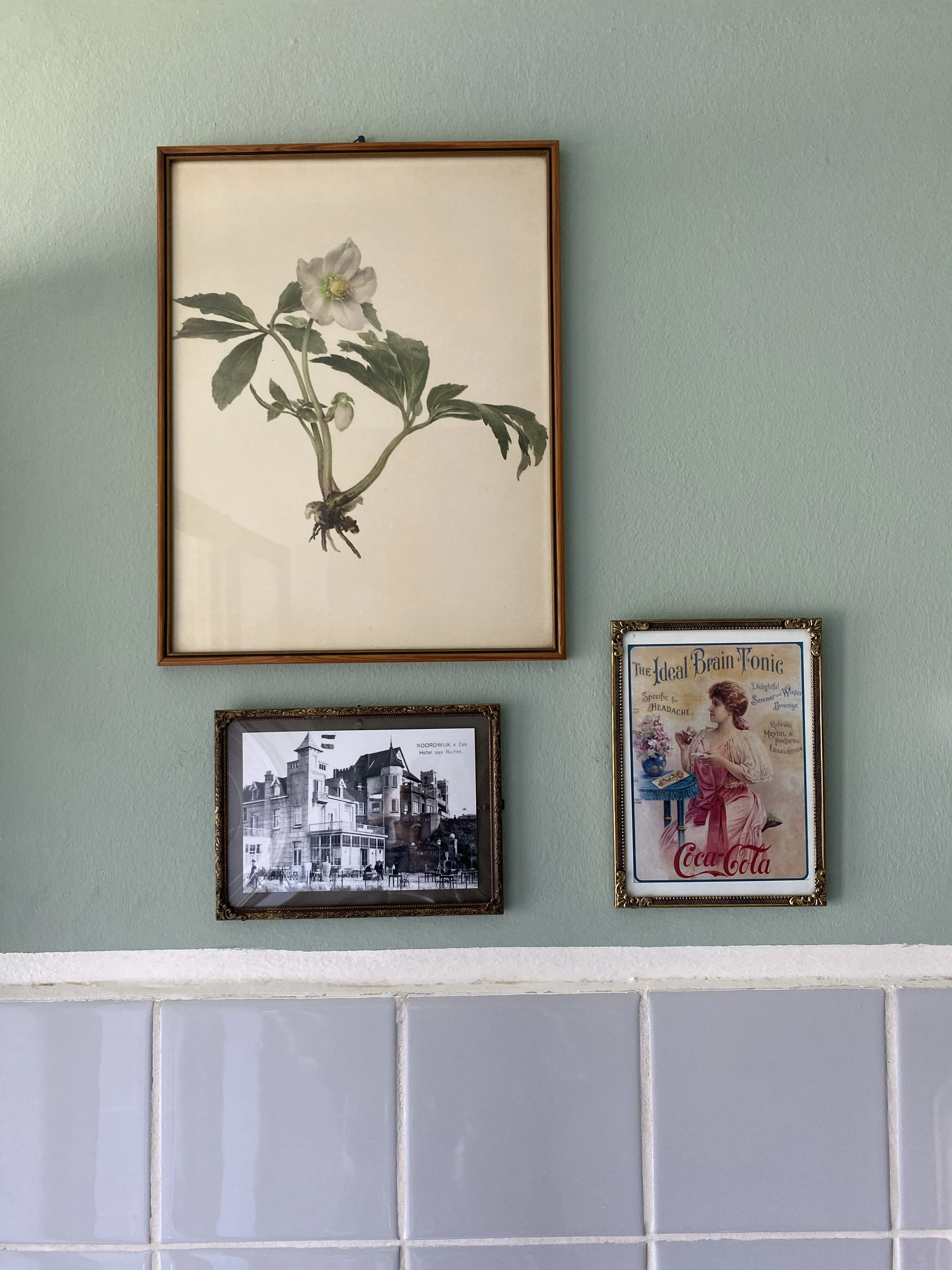
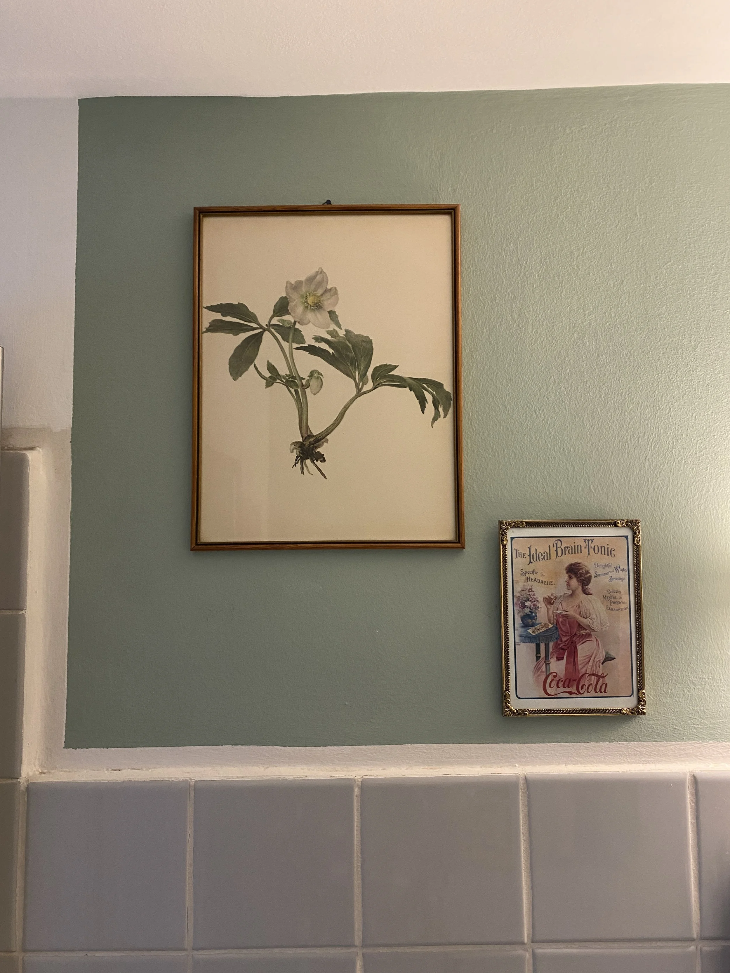
The Bathroom
The Bathroom
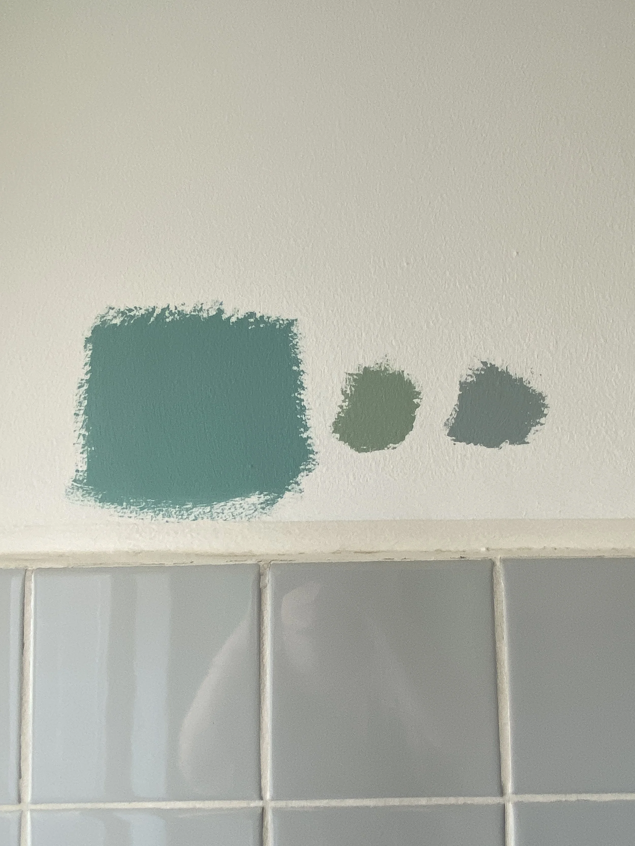
The bathroom had before grey tiles, old stained white walls and no particular special accessories except a build in wall cupboard mirror from the late 50s which was special and I had the feeling should be made to stand out more. Finding an exiting color that fits with grey tiles? Easier said than done. I tried out different shades. I knew I wanted to go into the direction of green or blue to keep a fresh bathroom feel to it but didn’t want to make it too dark. Finally I decided to go with a light green ‘spa’ color which has in itself a hint of white and grey tints which is why it works with the grey tiles. any other solid color would have given it a too strong contrast and made the bathroom look tiny. The greey green color also combines well with the vintage silver towel holder as well as gold.
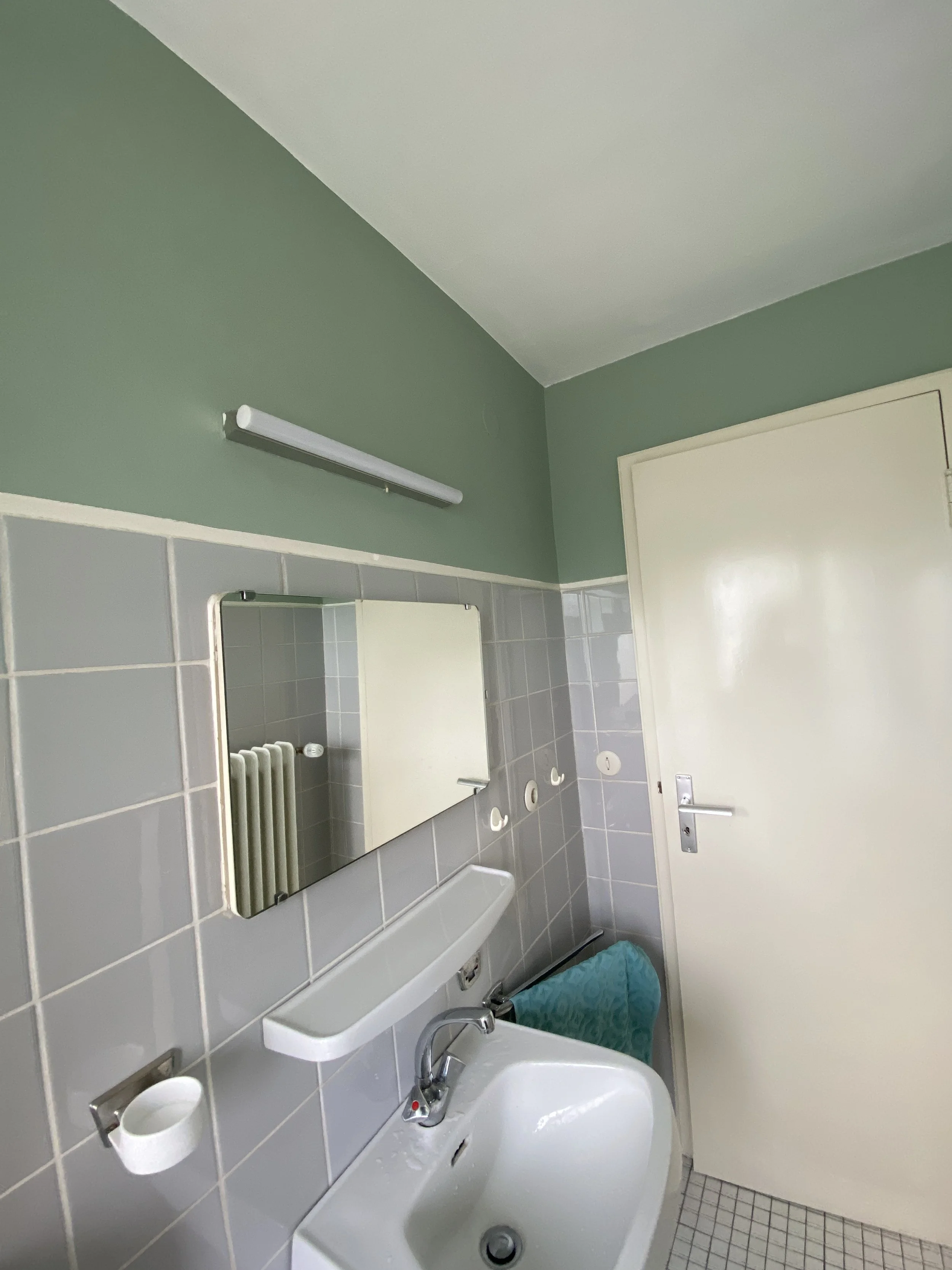
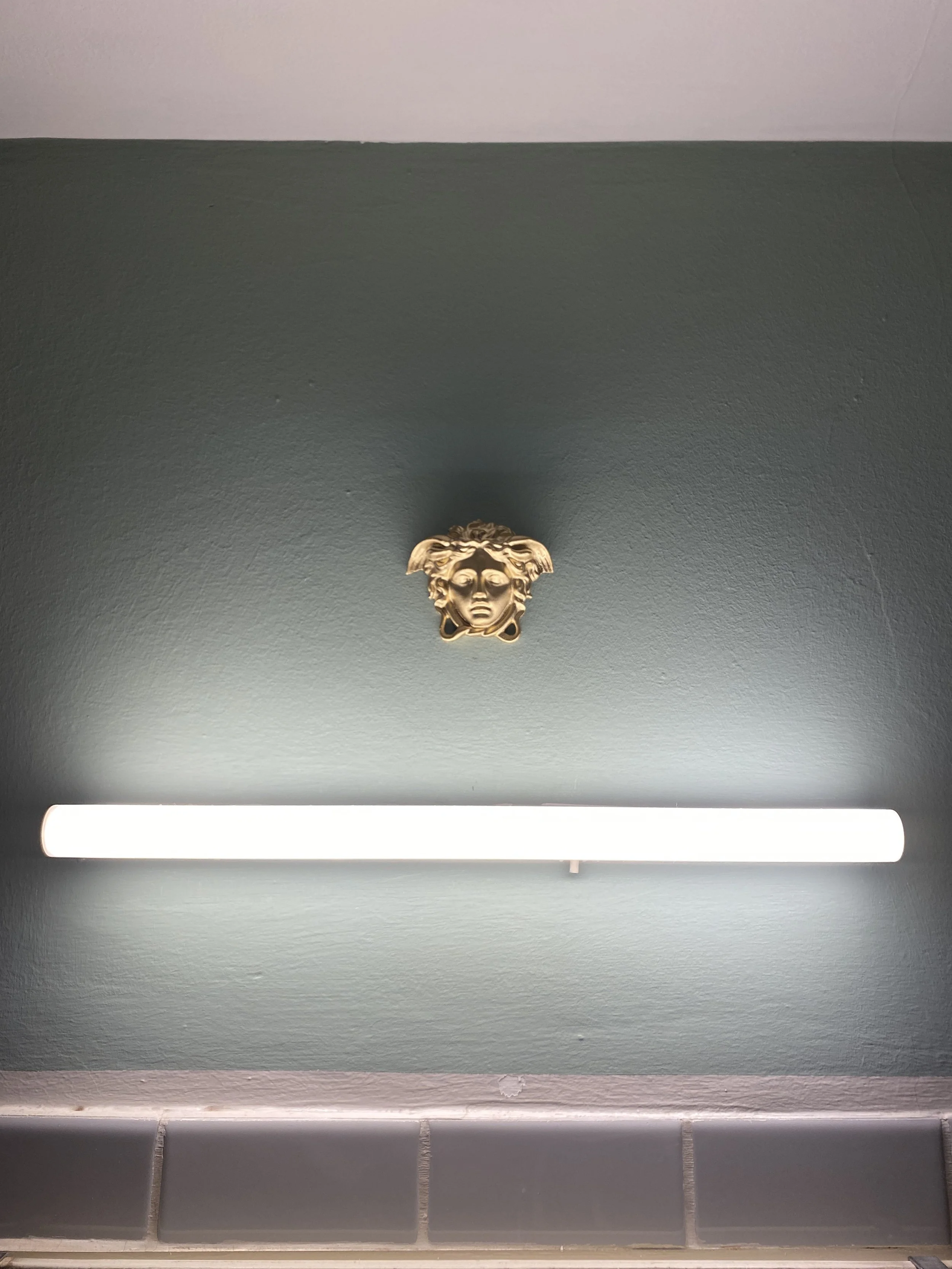
After having added the color I thought the space looks now too wide and smooth (funny I know). To bring back the old feel I thought adding vintage paintings and photographs could do the trick. Browsing online I also found this small business that sells gorgeous plaster deco elements. I added one gold element directly above the mirror to draw attention to the old design and in the evening when the mirror light is on, the gold plaster element really comes to life and adds a sparkle to the room.

Copyright Maria Makurat 2026